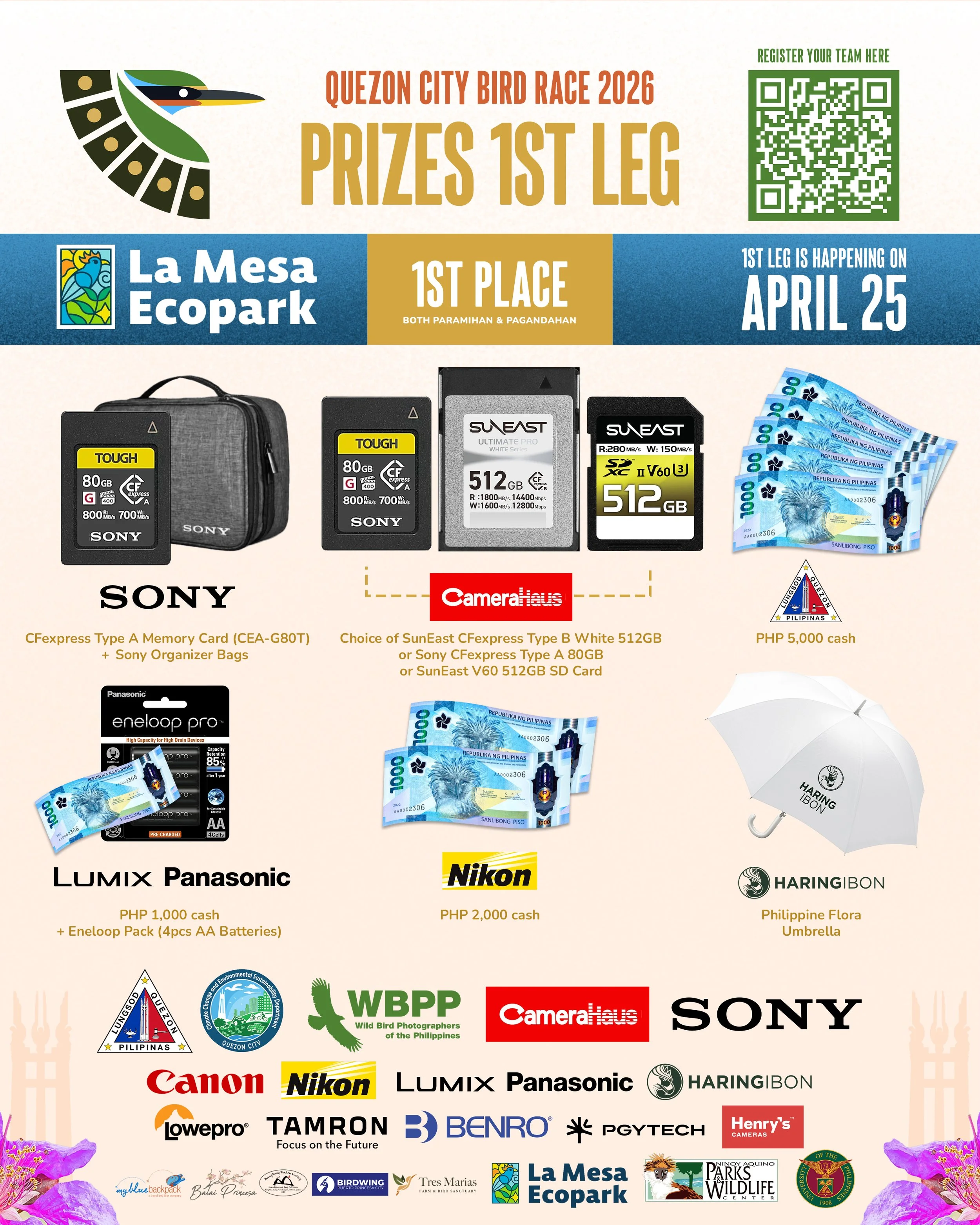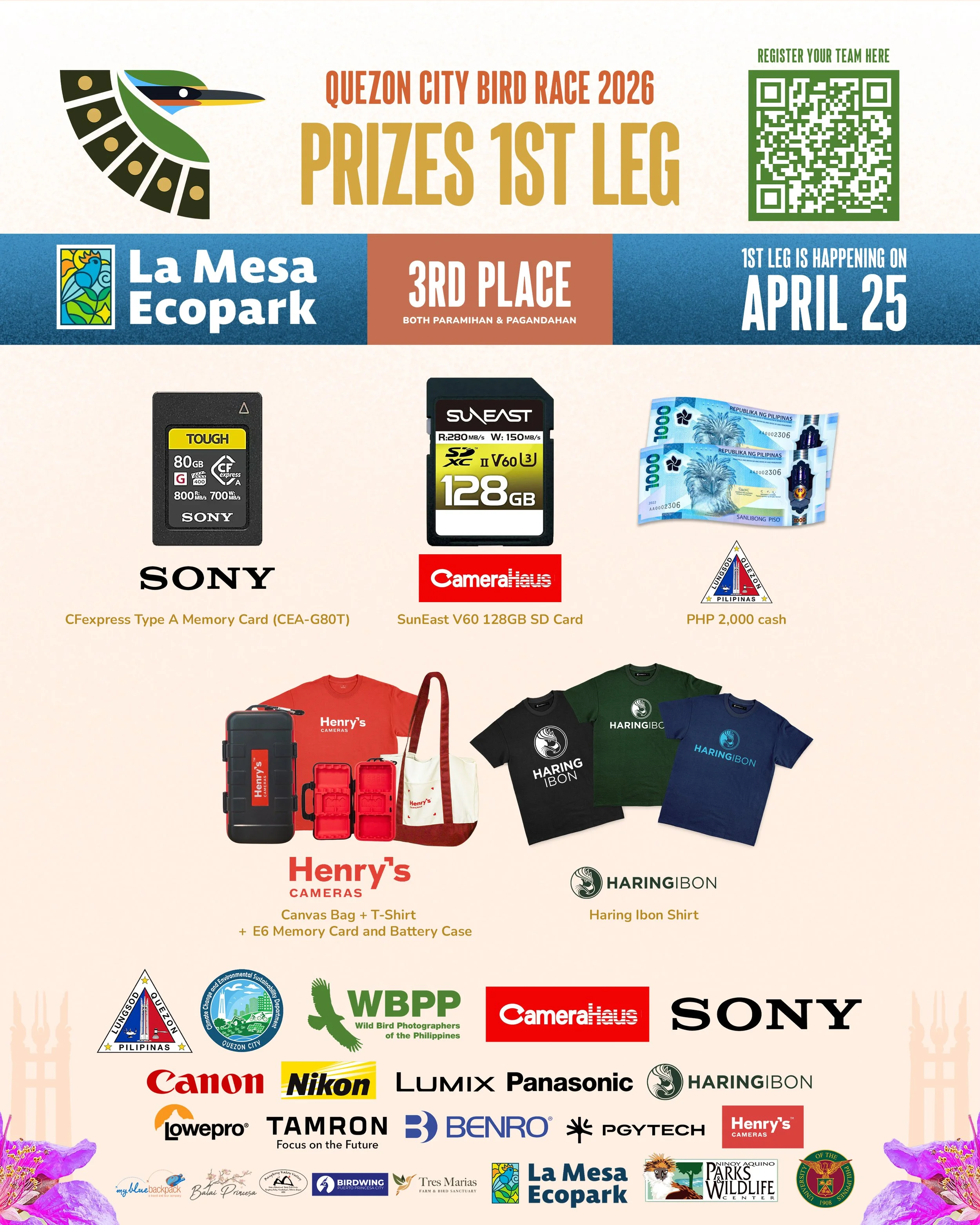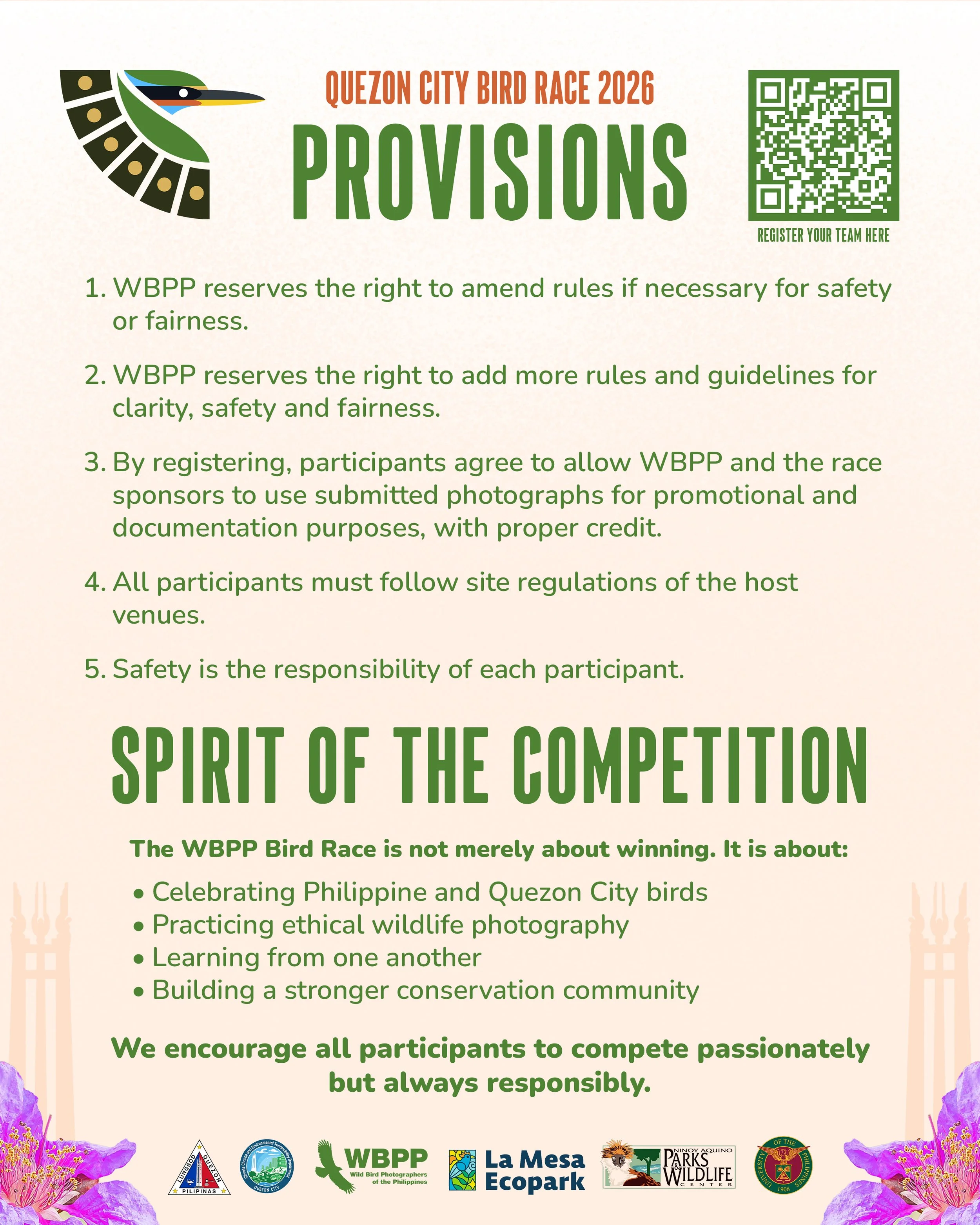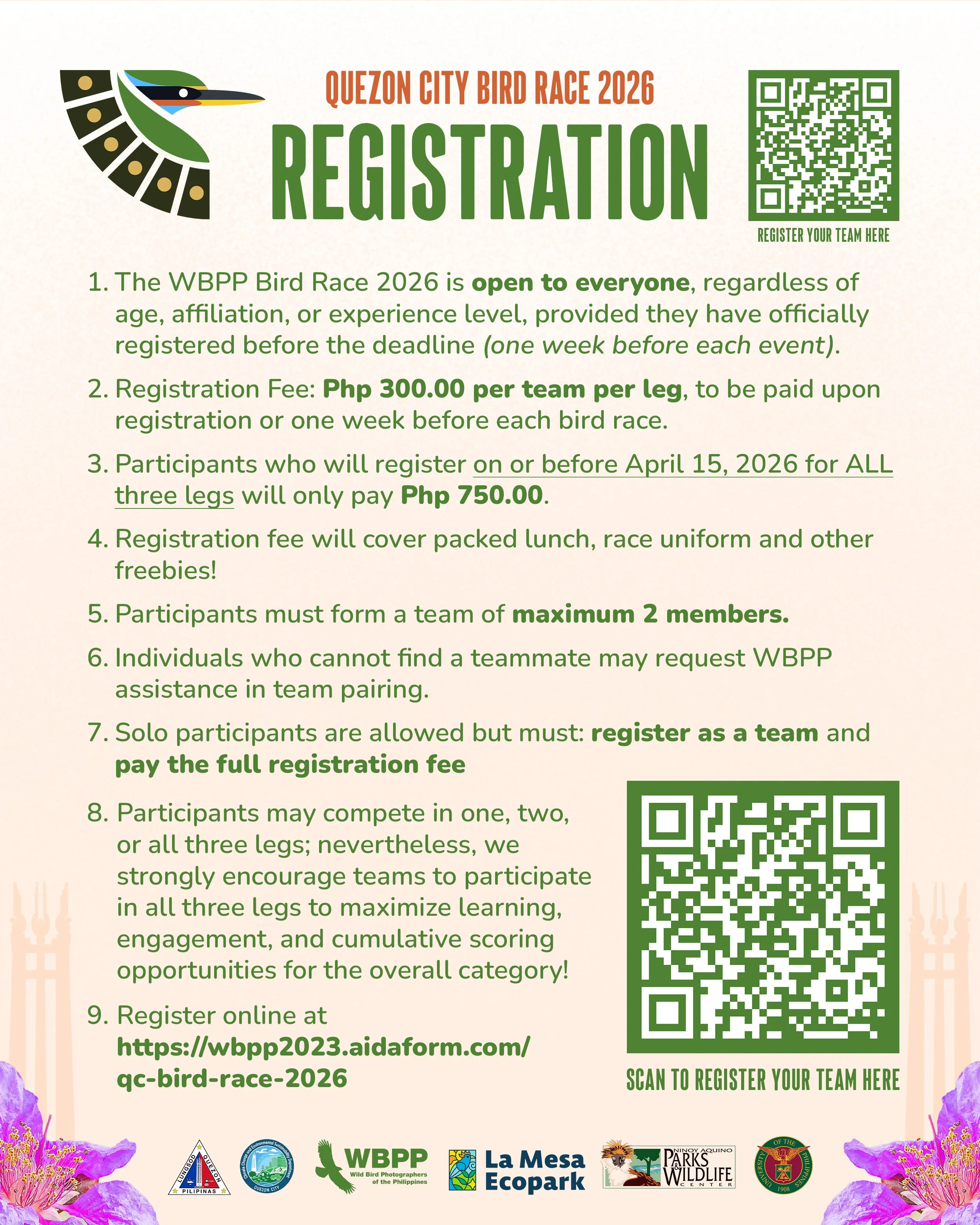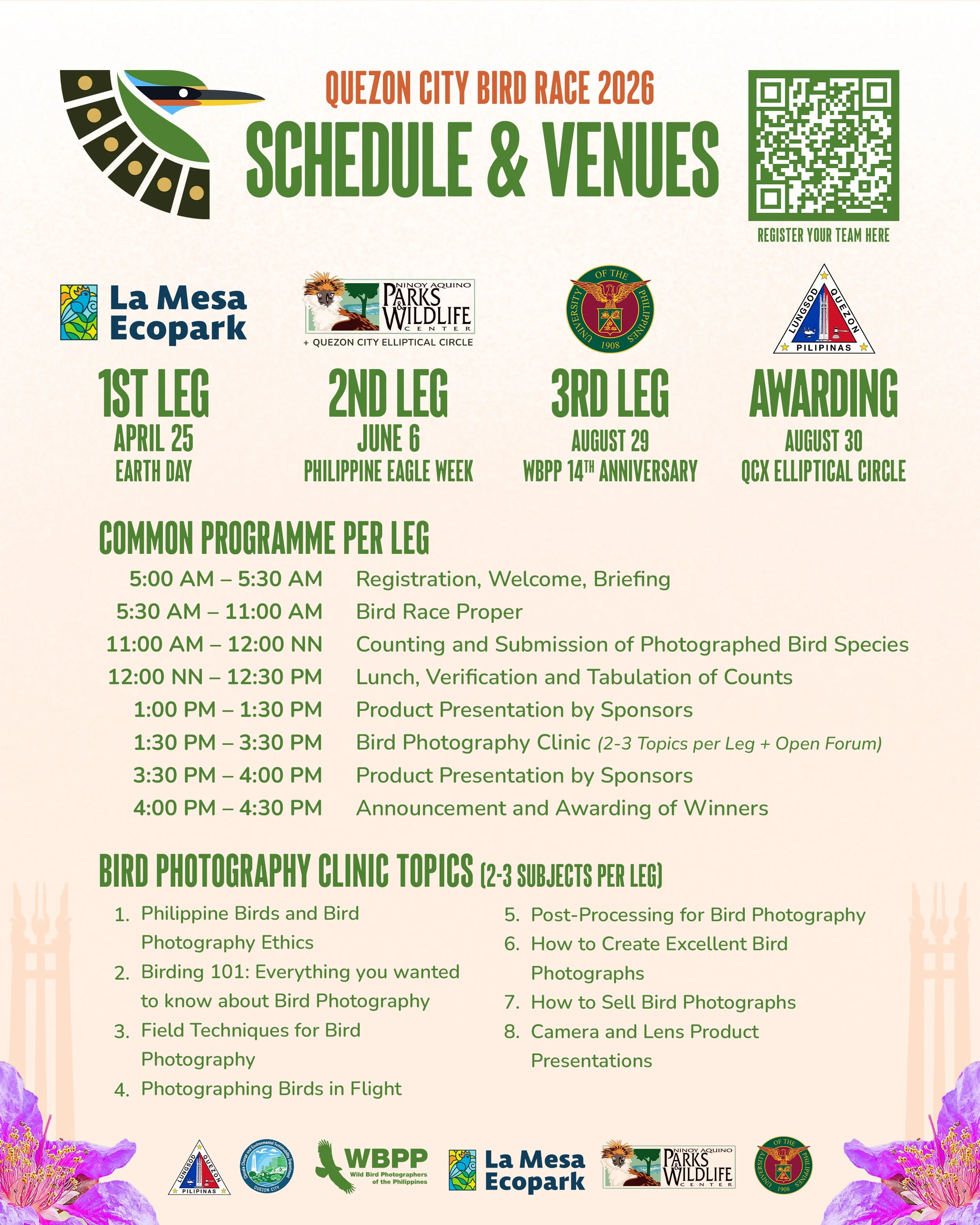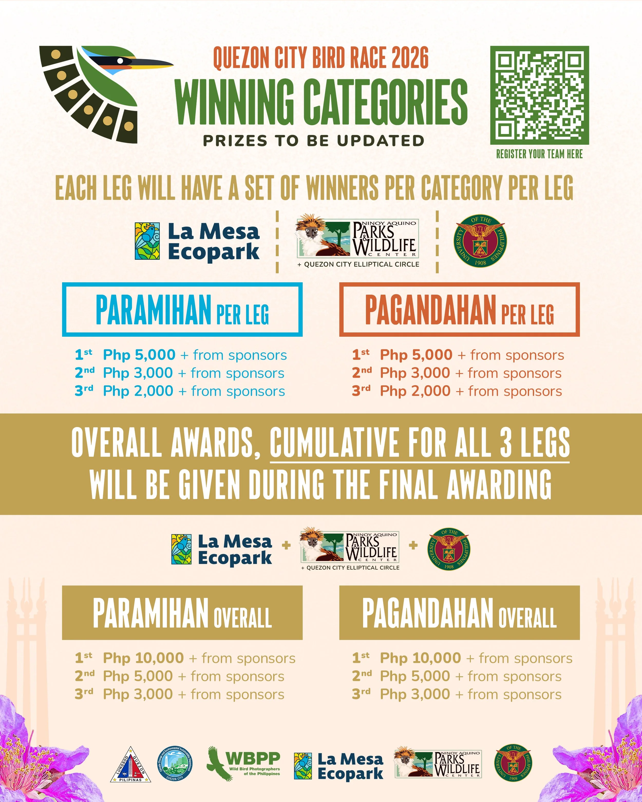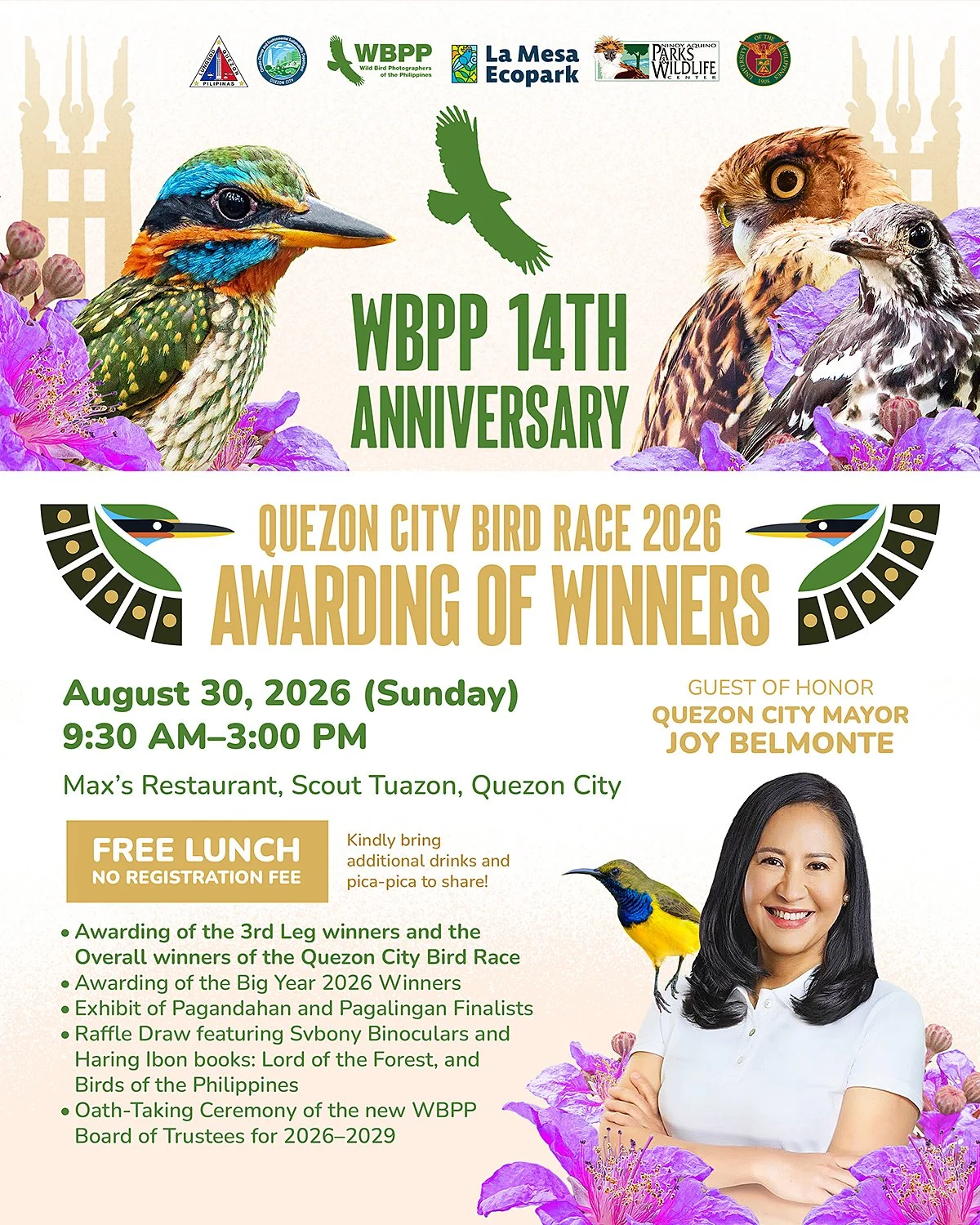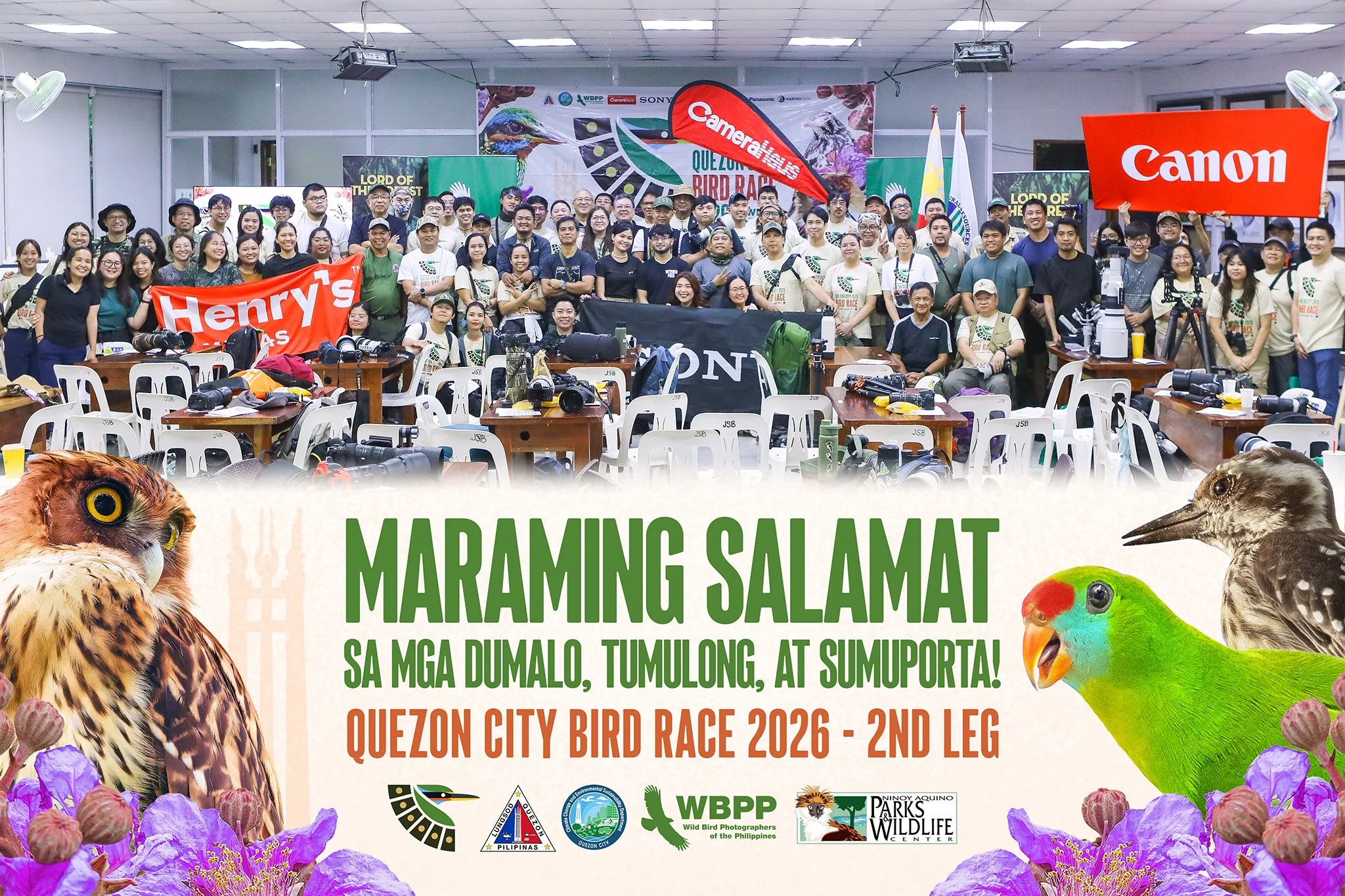
2026 Quezon City Bird Race
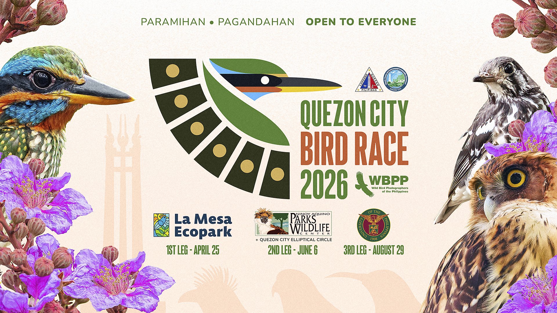
In 2026, the Wild Bird Photographers of the Philippines and the Quezon City Government partnered to create the first-ever Quezon City Bird Race. This three-leg bird photography event promotes appreciation for Philippine birds, ethical wildlife photography, and awareness of biodiversity conservation.
Quezon City Bird Race 2026 is the first bird race of this scale held in Metro Manila. Unlike other bird races, the Quezon City Bird Race has three legs: the 1st Leg at La Mesa Ecopark, the 2nd Leg at Quezon Elliptical Circle and the Ninoy Aquino Parks and Wildlife Center, and the 3rd Leg at the University of the Philippines Diliman.
Given my background as a bird photographer, being a member of the Wild Bird Photographers of the Philippines, and as an established graphic designer, the WBPP and the Quezon City Government commissioned me to create the logo for this momentous 3-part event.
Bird Selection

When conceptualizing the logo, other organizations handling bird races use multiple birds to represent the race; a simple, minimalistic approach using only text; or a fully illustrated drawing to represent the entire race.
For this logo, I chose a single bird to represent the Quezon City Bird Race for its first iteration. Since this project is a first-time thing, we aren't even sure if we will be designing with future iterations in mind. In Puerto Princesa, Palawan, the logo for the Bird Photography Race changes each year to a different bird species. So for this approach, I'd like to keep it simple with just one bird for this one race. If there's a second Quezon City Bird Race, we'll see.
When selecting the bird to represent the Quezon City Bird Race, a couple of basic criteria need to be met. First, it must be endemic to the Philippines to represent our incredible biodiversity and high degree of endemism. Second, it must be important to Quezon City and recorded across all birding sites hosting the Quezon City Bird Race. Third, it has to have a "fast look" to it, since this is a race after all.
Among Quezon City's star birds, the Philippine Eagle-owl, Ashy Thrush, and Spotted Wood Kingfisher are easily among the city's top three most important birds. However, for the purpose of designing a logo, the Spotted Wood Kingfisher was the easy choice for the Quezon City Bird Race logo. Among the three birds, it is the only one with a "fast look" with their long, pointed bill and relatively slender (yet robust) build. The Kingfisher is much more colorful than the other birds in the area, with greens, blues, oranges, and yellows across its plumage. As a silhouette, it is more visually distinct than a Thrush and, especially, an Owl, which is commonly used in many logos across the Philippines and would be very tricky to make distinctive.
Logo Concepts and Explorations
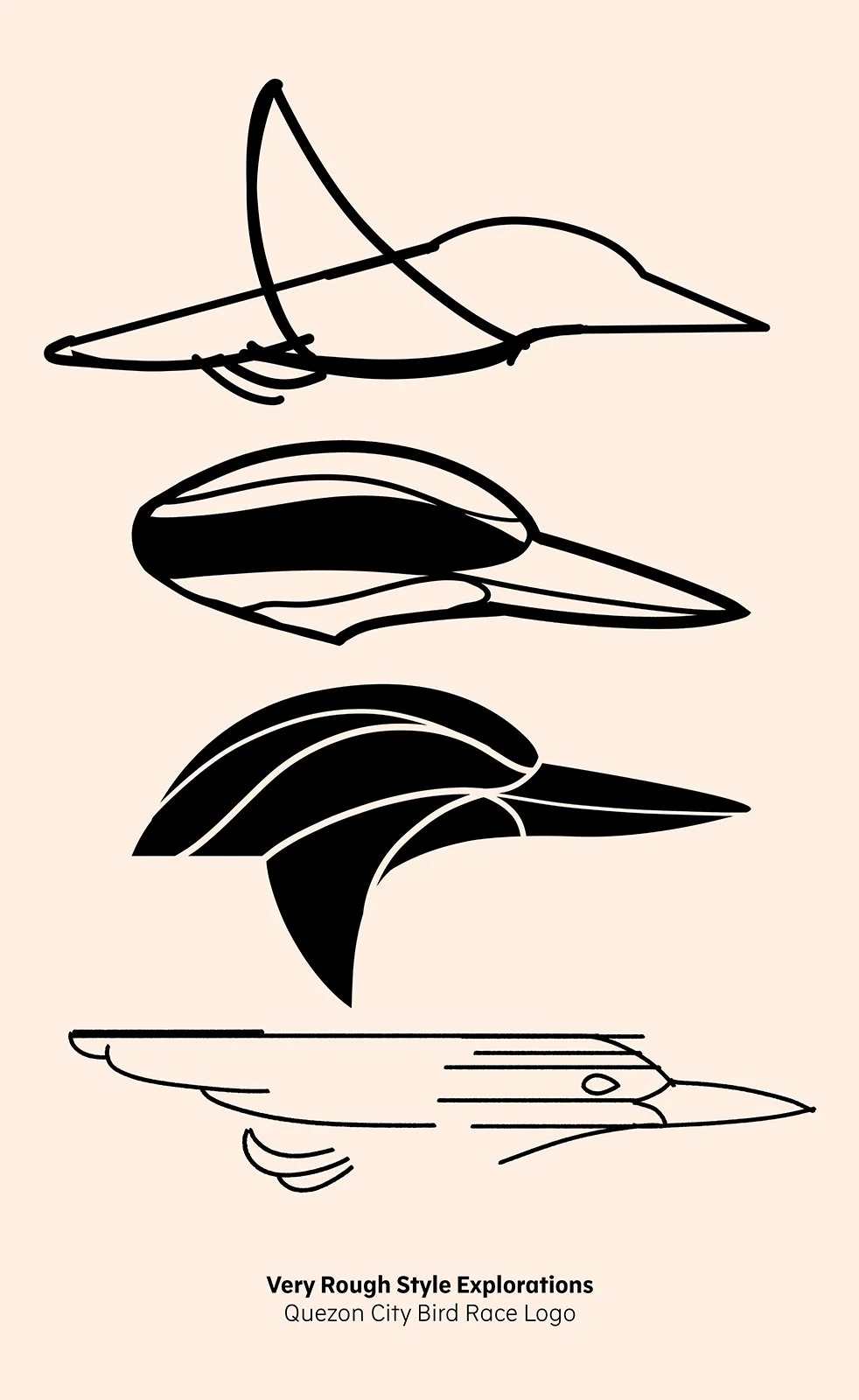
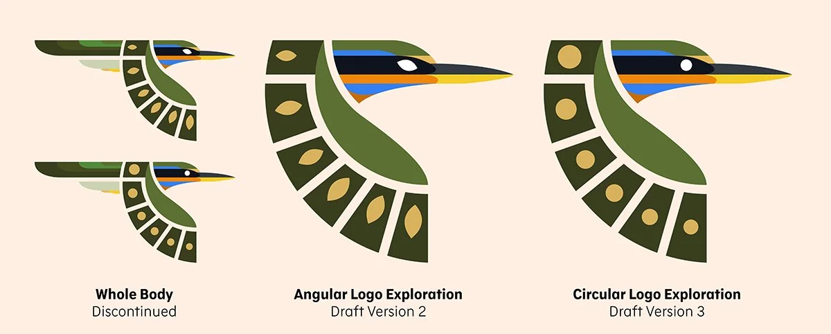
Early explorations for the Quezon City Bird Race logo involved drawing silhouettes, rough sketches, and experimenting with positive and negative space in the bird's plumage patterns in small logo forms.
Although this was a logical step in developing the logo, it only addressed one part of the logo: the "Bird Race" part. I still needed to experiment with combining the Spotted Wood Kingfisher with the "Quezon City" element of the race to make it distinctive and easily recognizable to Quezon City residents. This led me to research Quezon City's design scene, which, although largely contemporary today, has a past built on postwar foundations rooted in the Philippine modernist movement. Inspiration came when I thought of the city's most iconic structure: the Quezon City Memorial Shrine Monument. However, it would be cheesy (and cliché) to use the monument's silhouette, since so many of Quezon City's designers and promotional materials have already used it for past events.
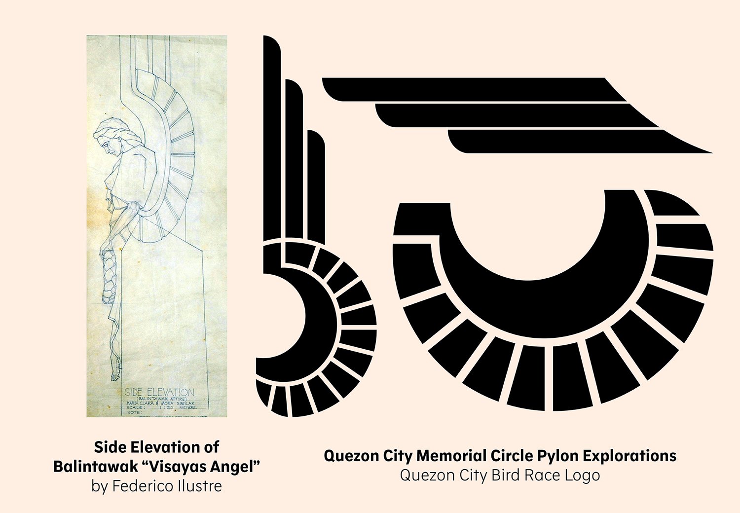
I became selective in my inspirations, focusing on one part of the monument: the Pylons depicting Angels that represent Luzon, Visayas, and Mindanao. All three angels share a similar Art Deco style, reinterpreting their wing feathers as angular blocks, and I think nodding to Quezon City's most iconic structure in its smallest figure in a logo brings the "Quezon City" element rightly so with the "Bird Race" element that I wanted in the logo.
I made a couple of explorations reinterpreting the Angel wings in black and white and eventually settled on a feather arrangement I was satisfied with for the final logo.
Final Logo
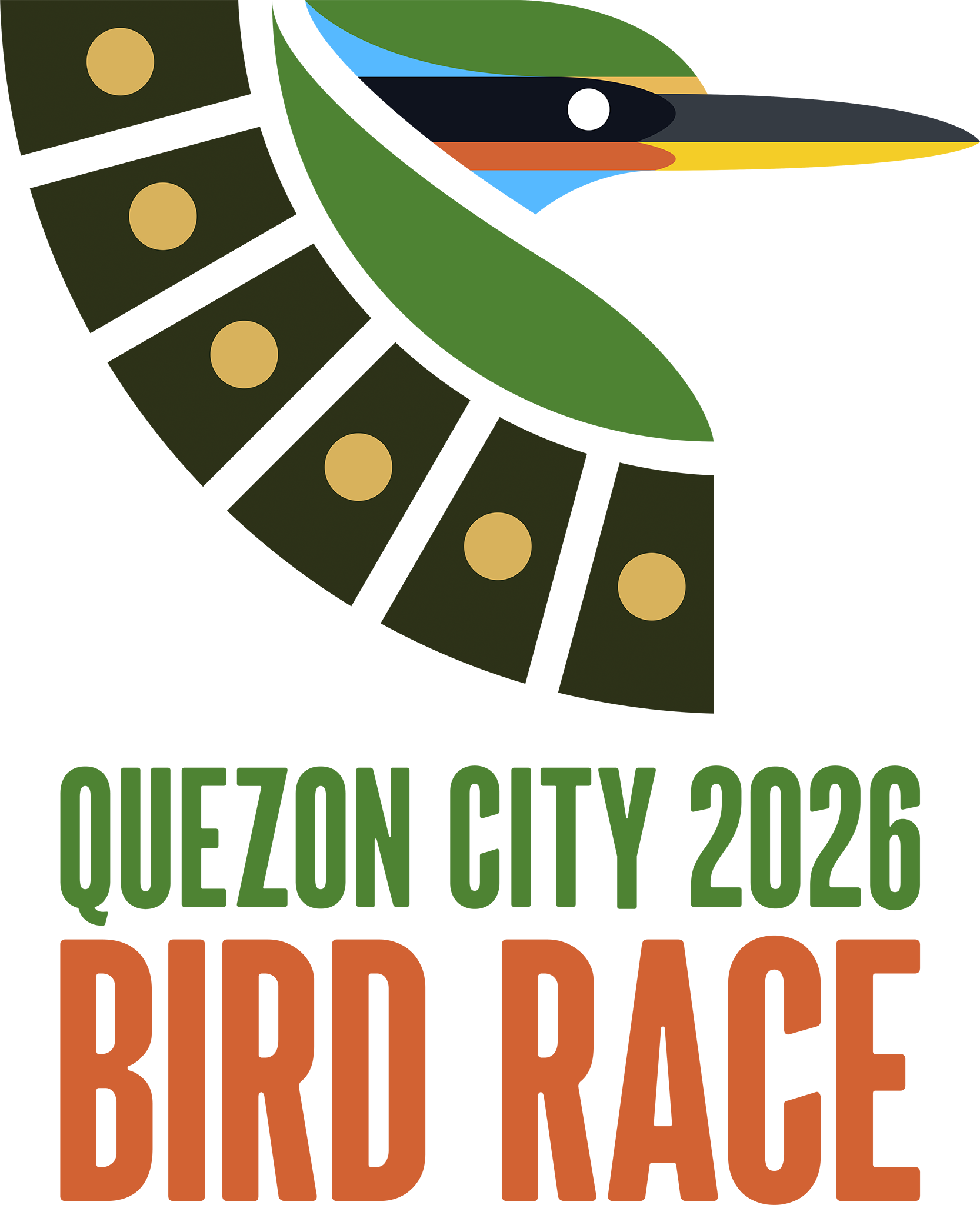
The final logo for the Quezon City Bird Race took the Art Deco approach of the wings found in the Quezon City Memorial Shrine Monument's Pylons, and it combined them with the colors and shape of the Spotted Wood Kingfisher into an emblem representing Metro Manila's biggest birding event. The final logo emerged in the 4th iteration, revising the shapes of the 3rd version to make it easier and more appealing for designers and the general public, with fewer awkward skews and more consistent straight lines and pleasing angles, especially in the black and white transparent versions to be given to Quezon City.
I had a lucky time exploring the Art Deco approach to the wing, since it led me to another element the organizers wanted to see: photography. Luckily enough, the wings in their segmented Art Deco approach gave off the look of aperture blades without being as obvious as so many camera club logos.
The Quezon City Bird Race colors are based on photographs of the Spotted Wood Kingfisher I took in La Mesa Ecopark, and the green in this logo matches the green used in the Wild Bird Photographers of the Philippines logo.




Additional Materials
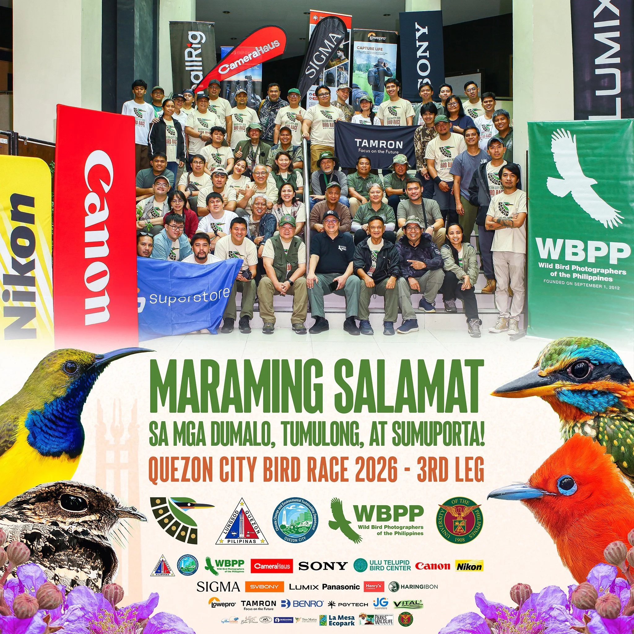
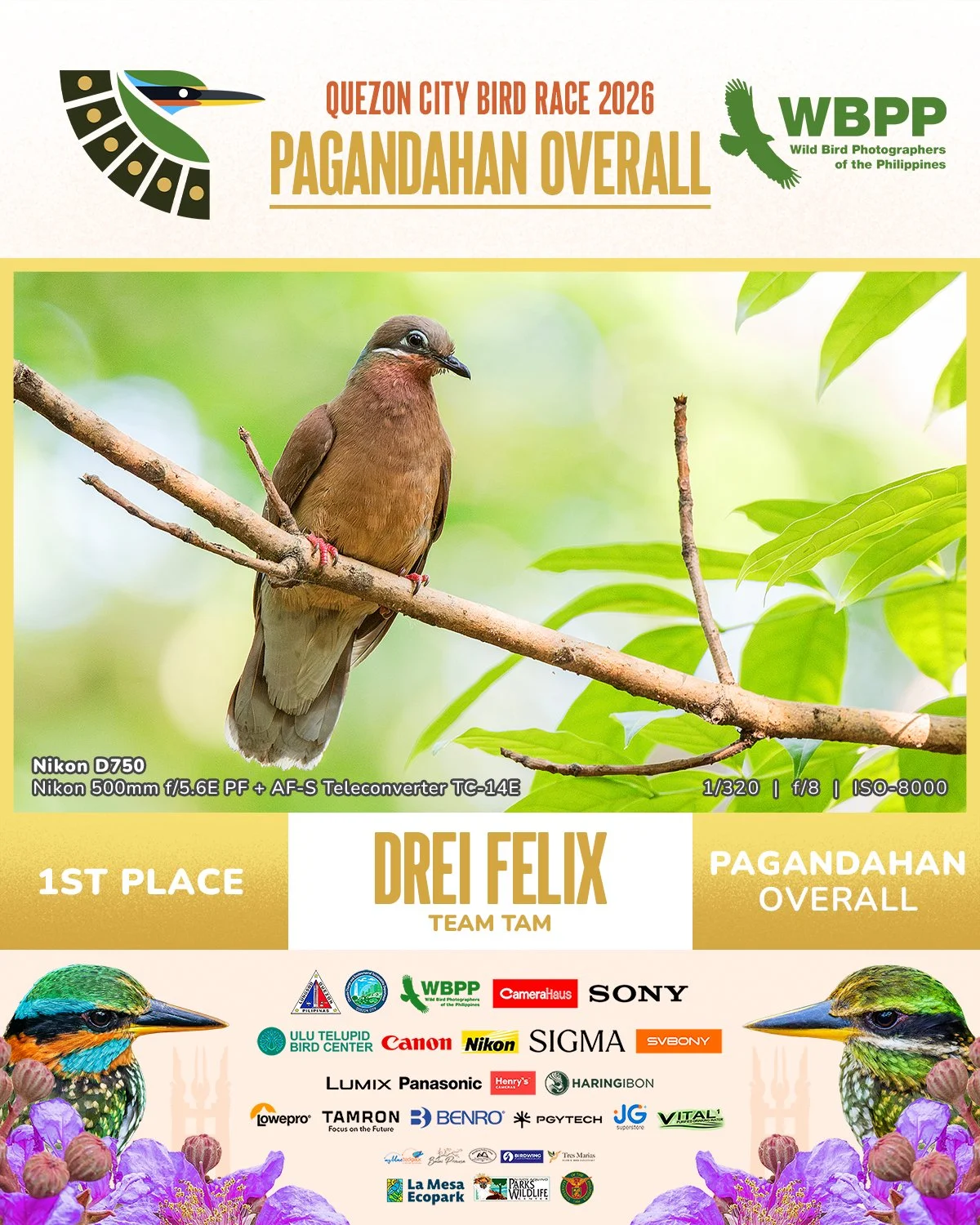
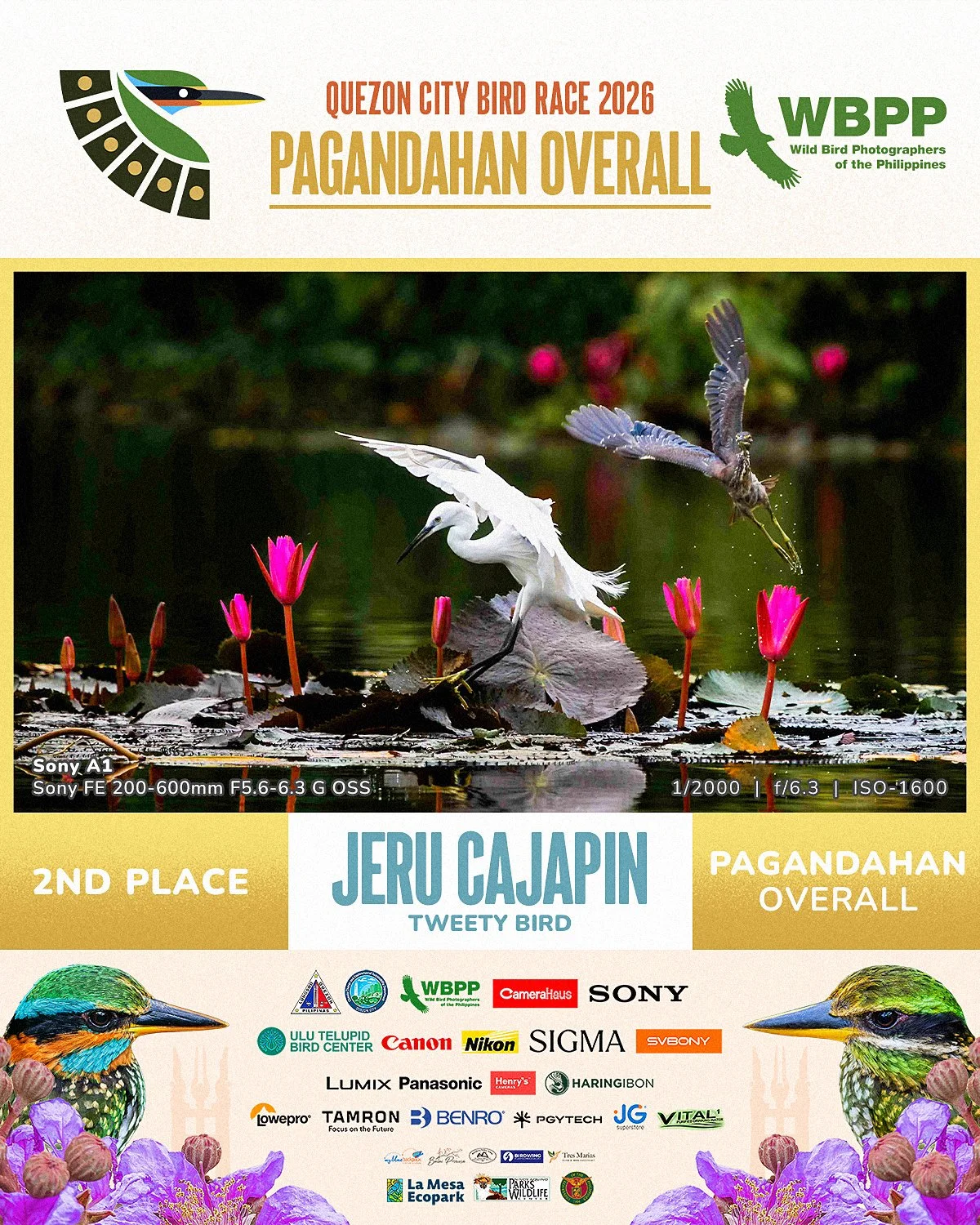
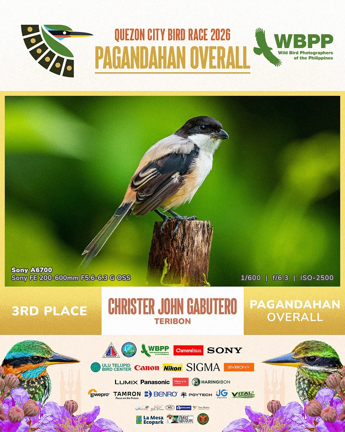
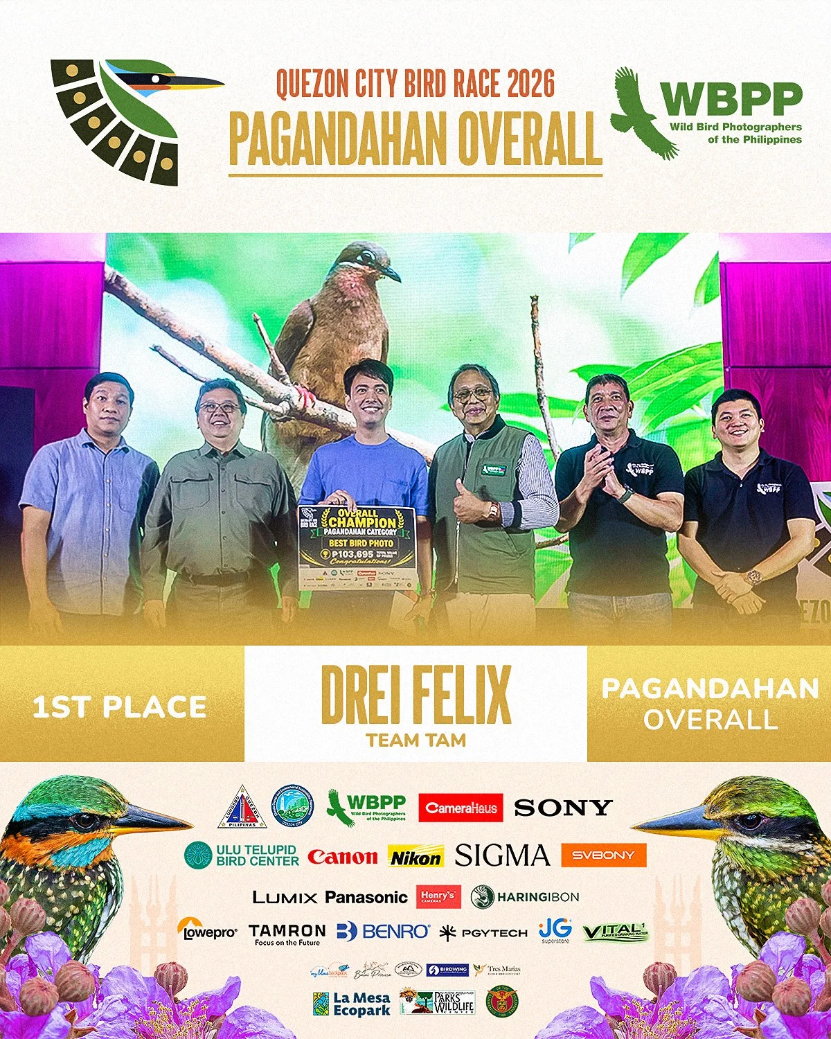
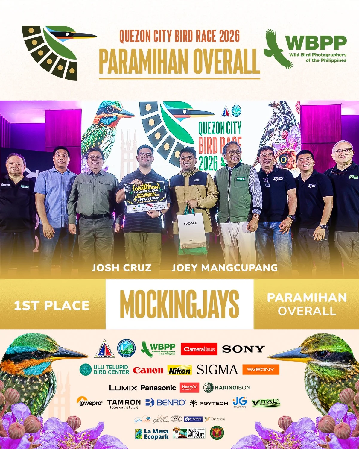
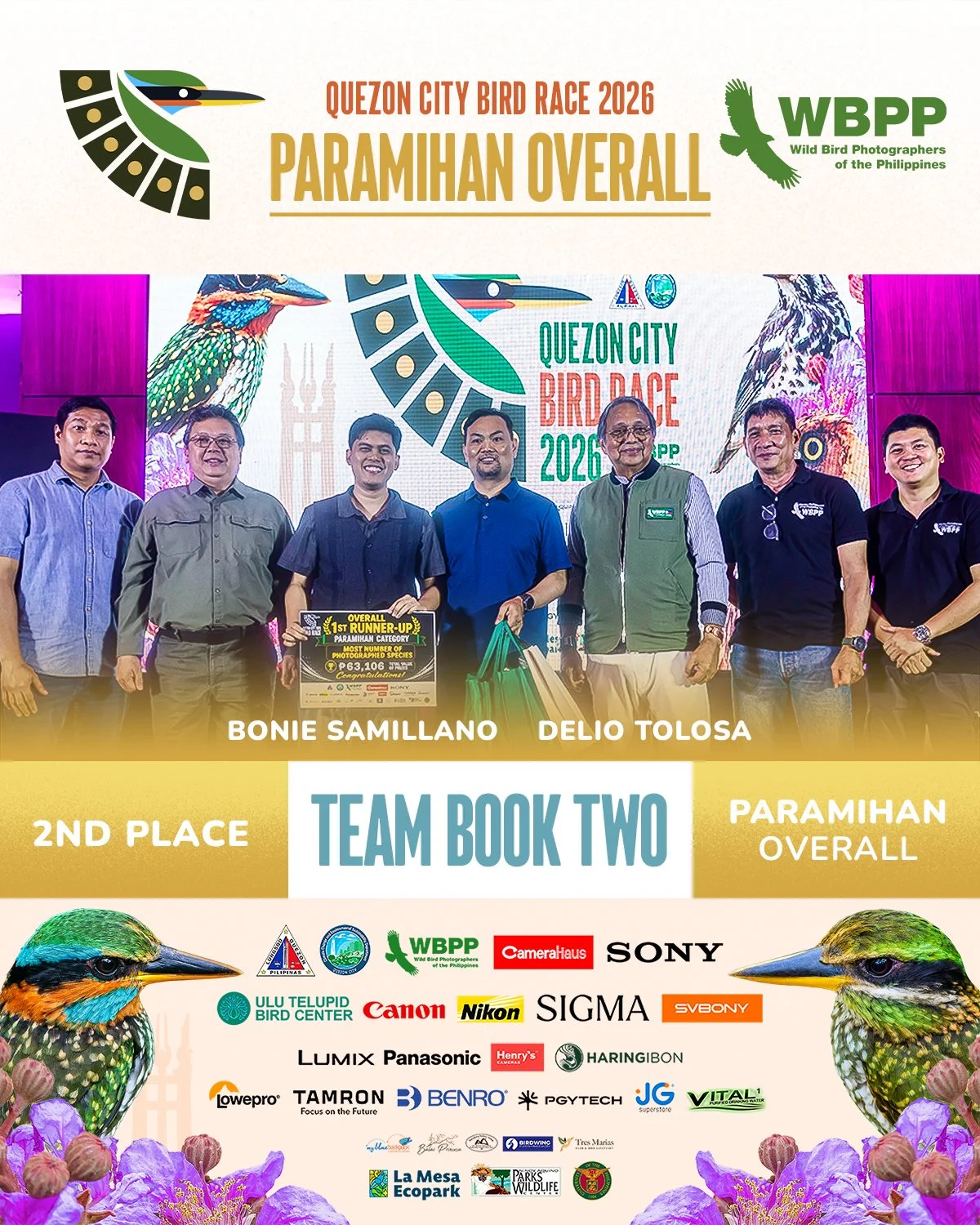
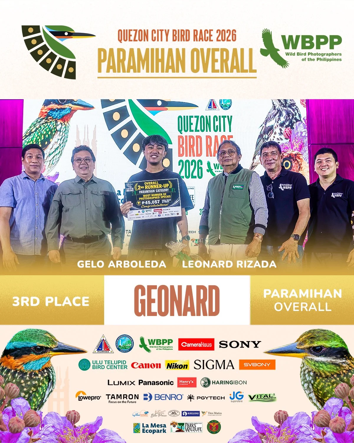
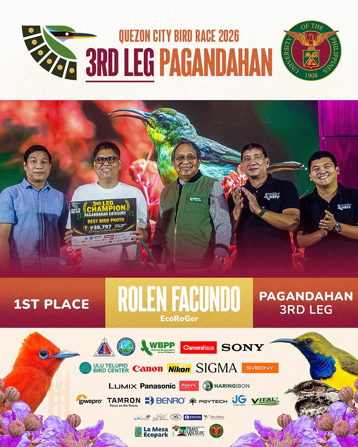
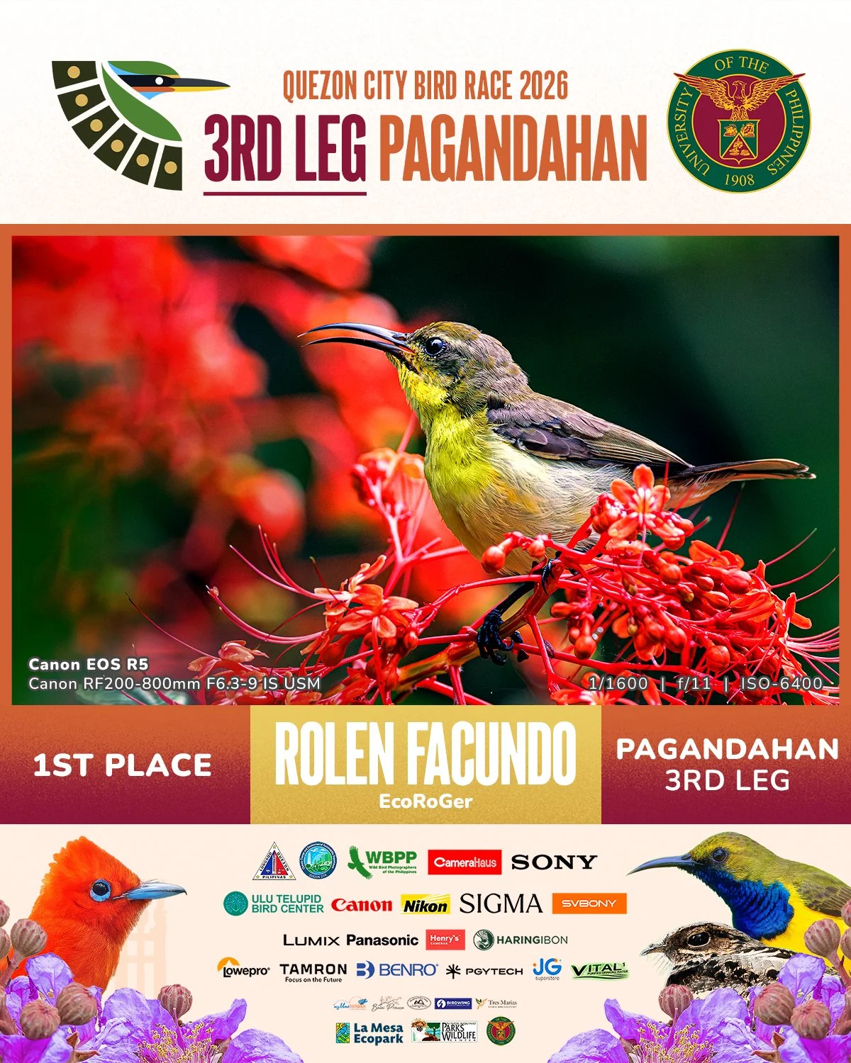
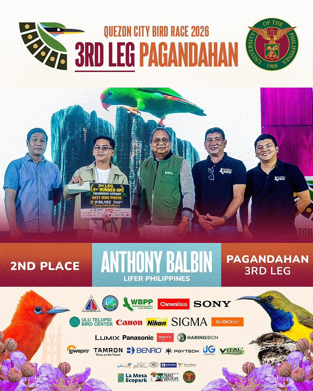
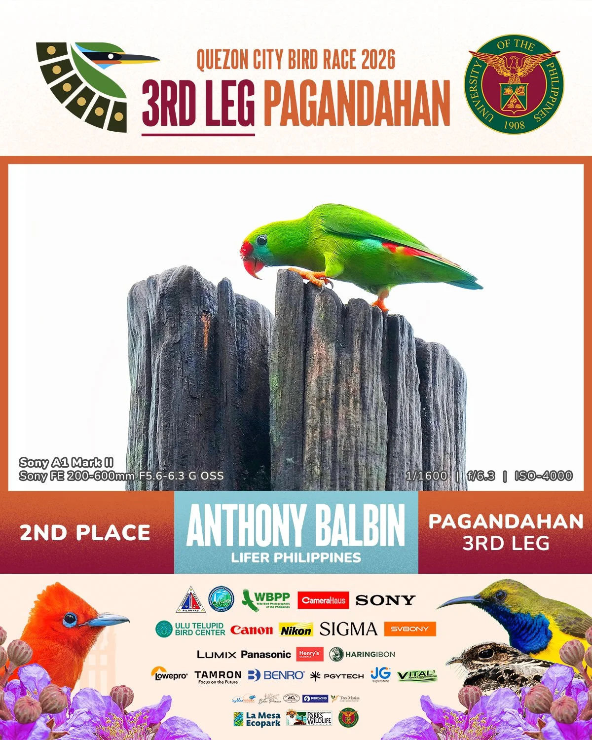
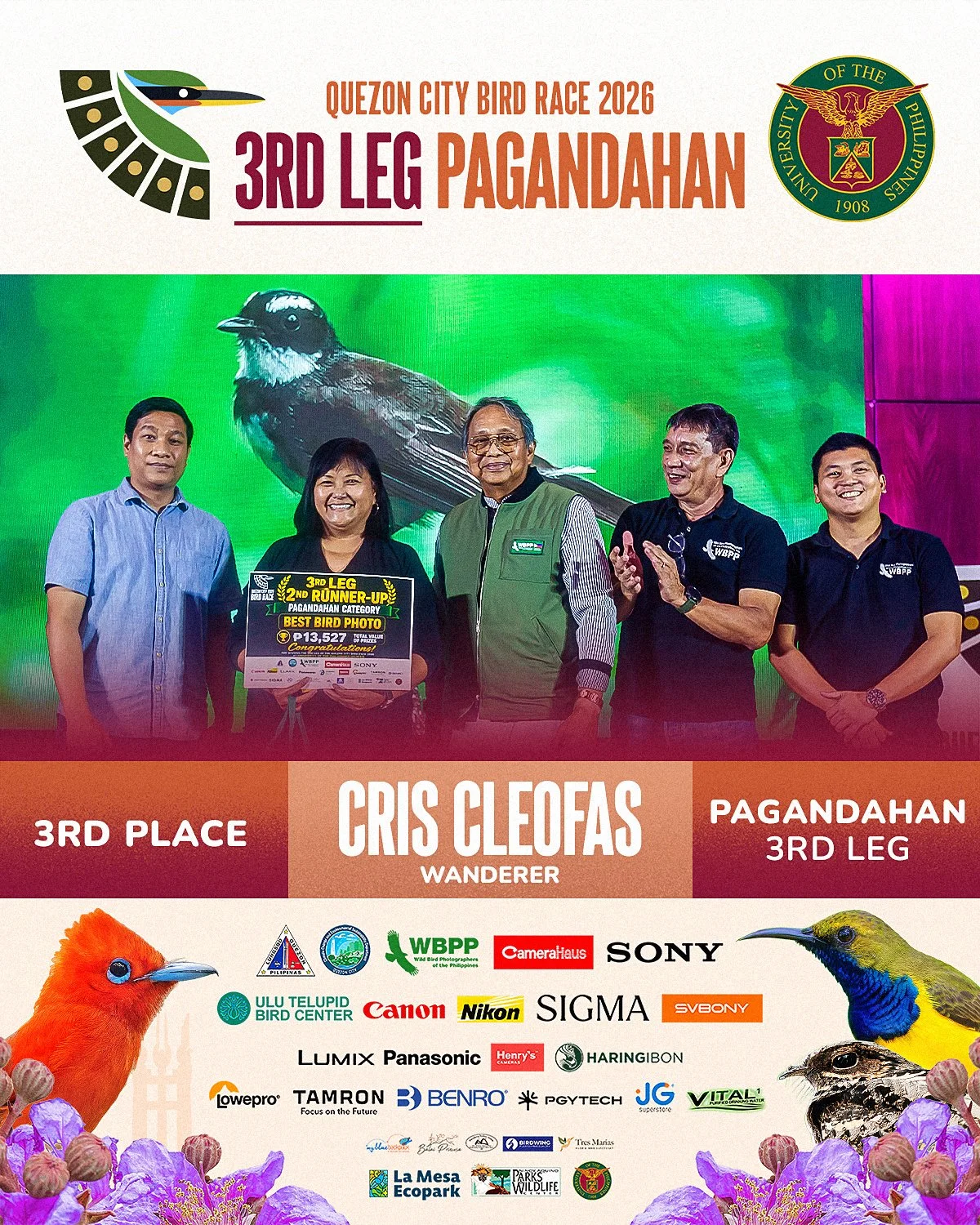
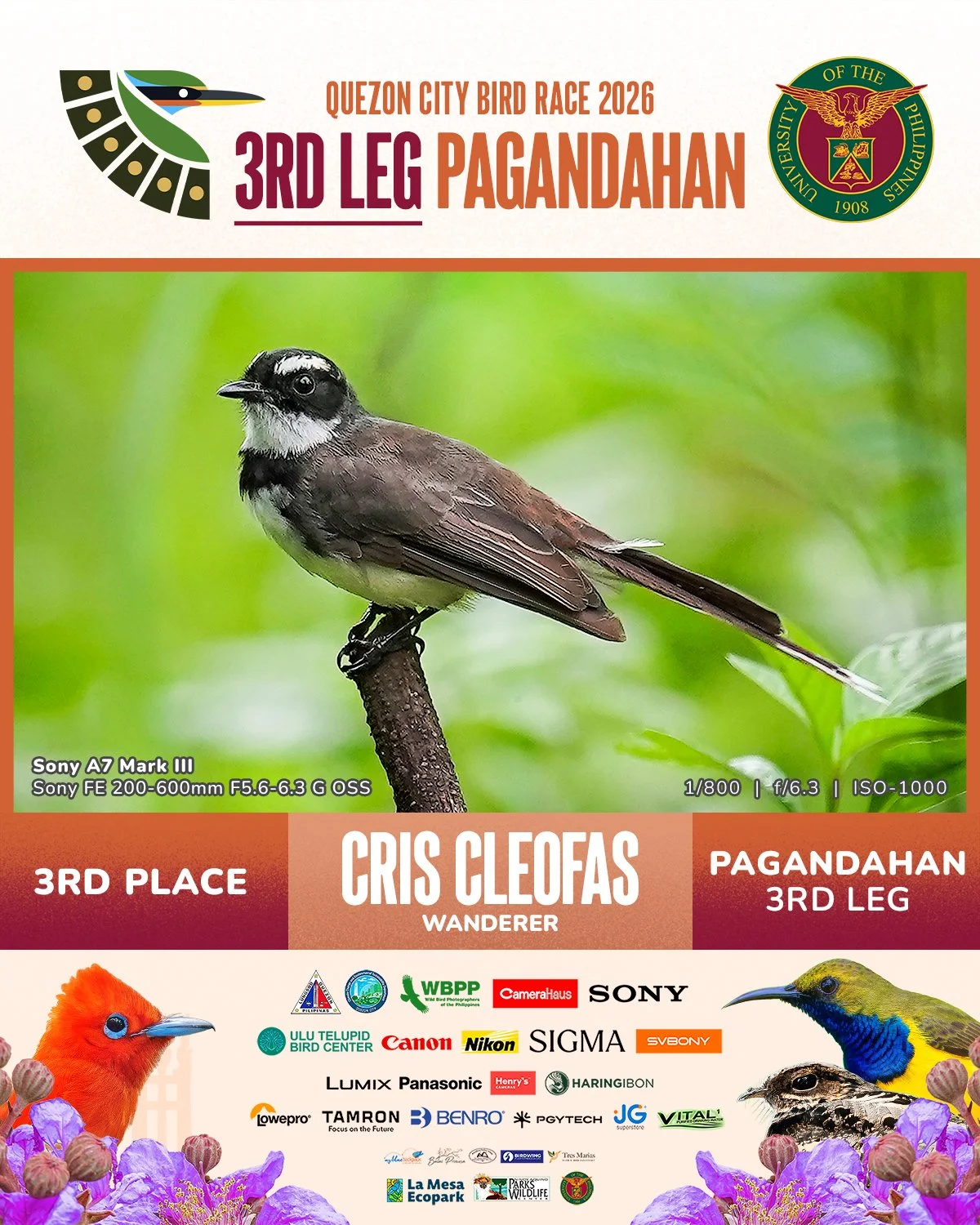
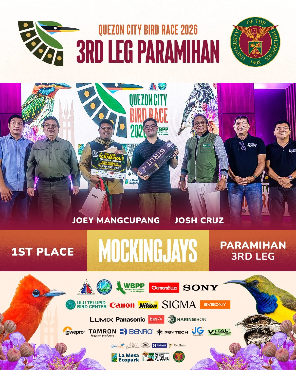
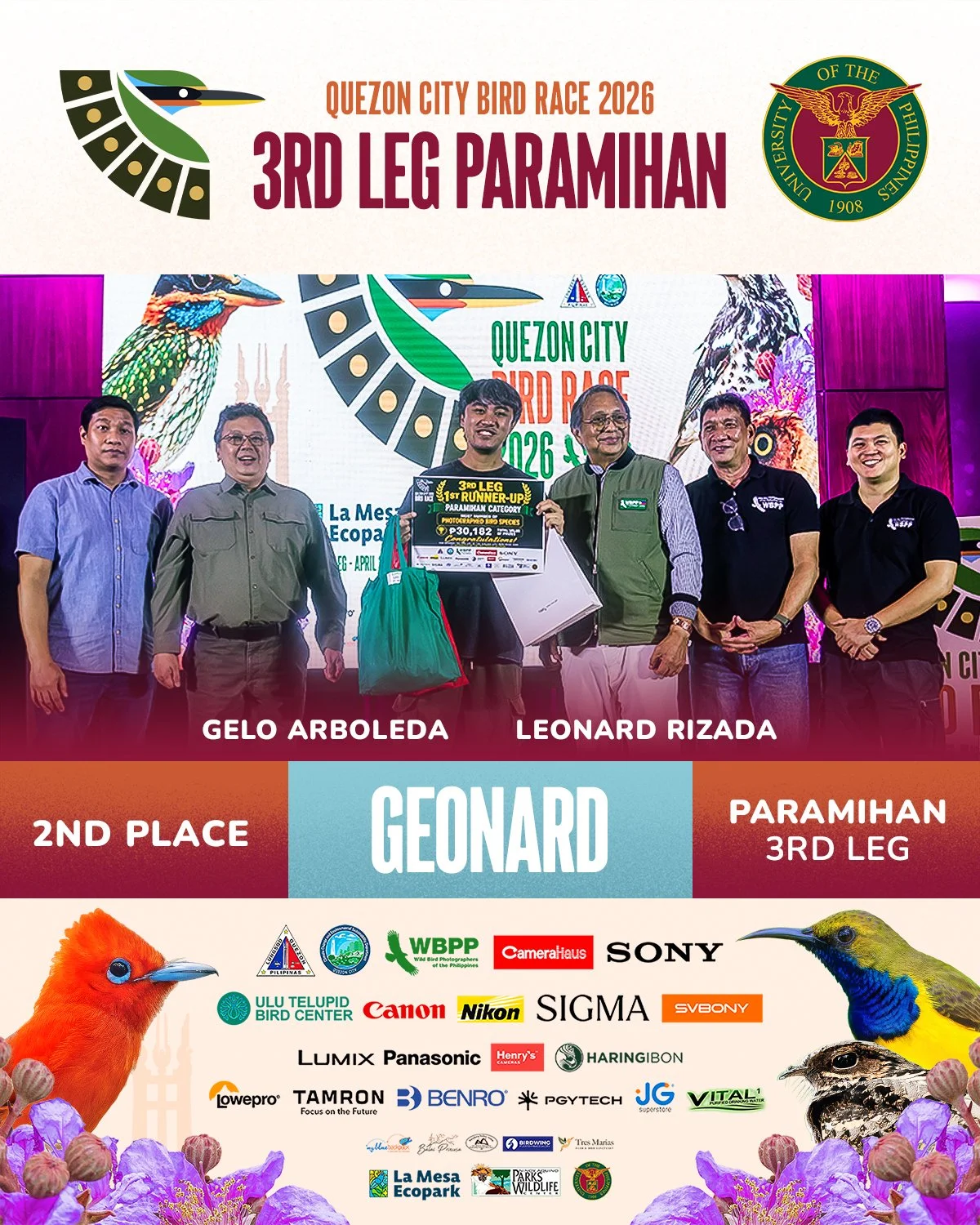
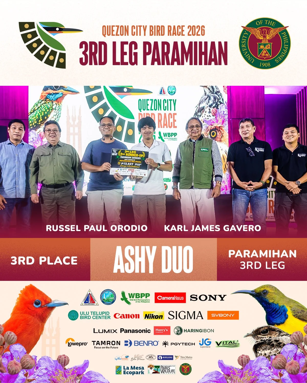
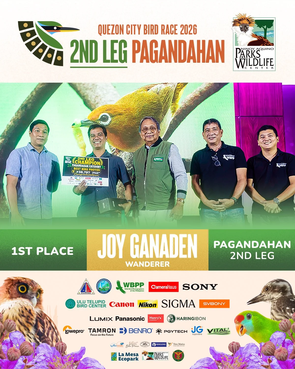
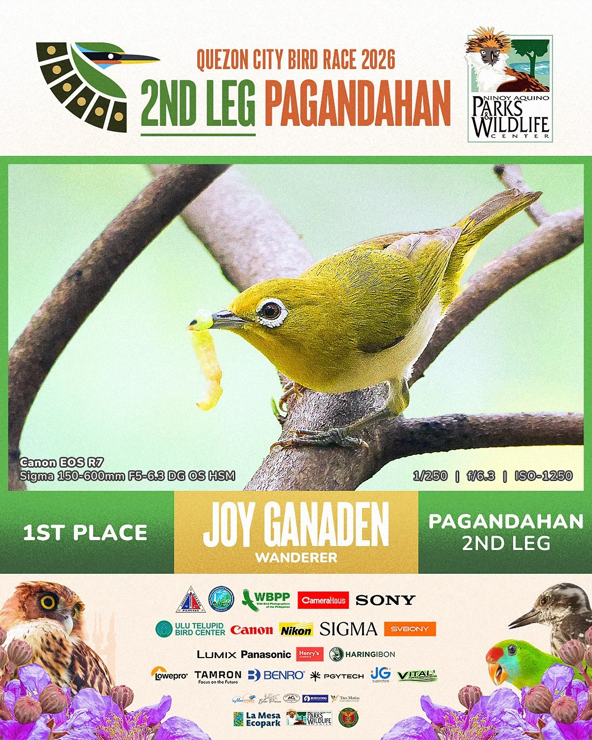
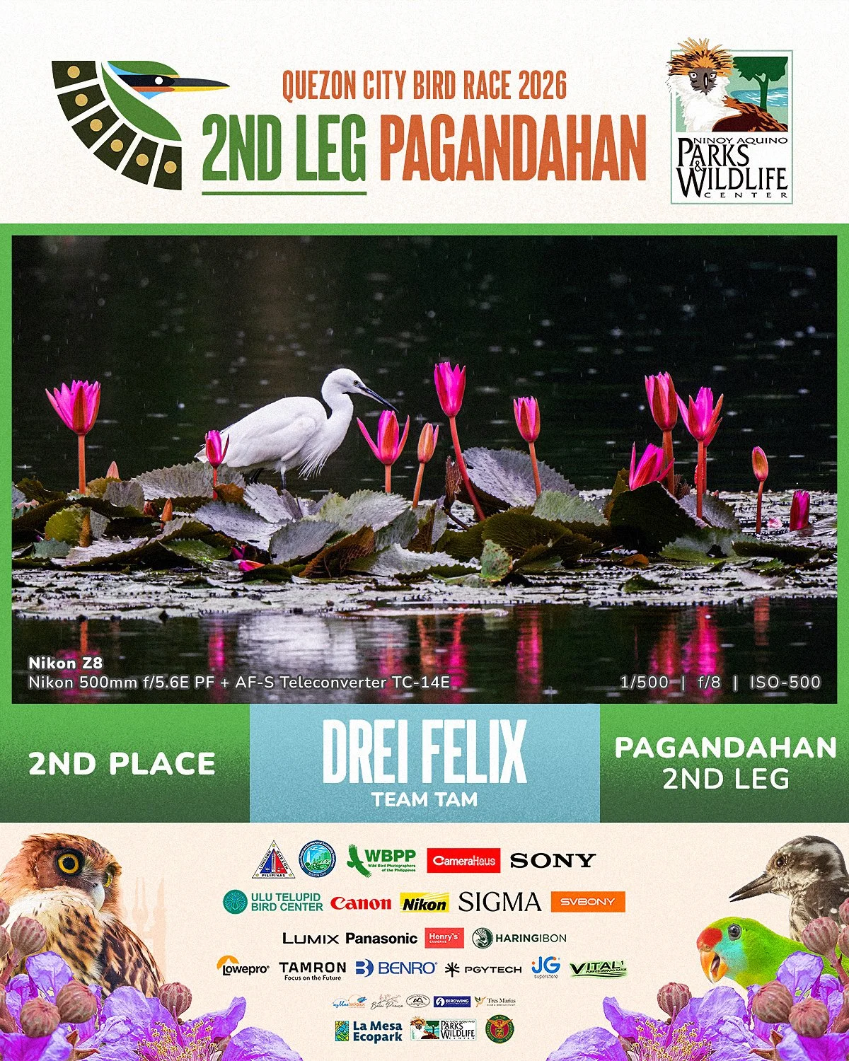
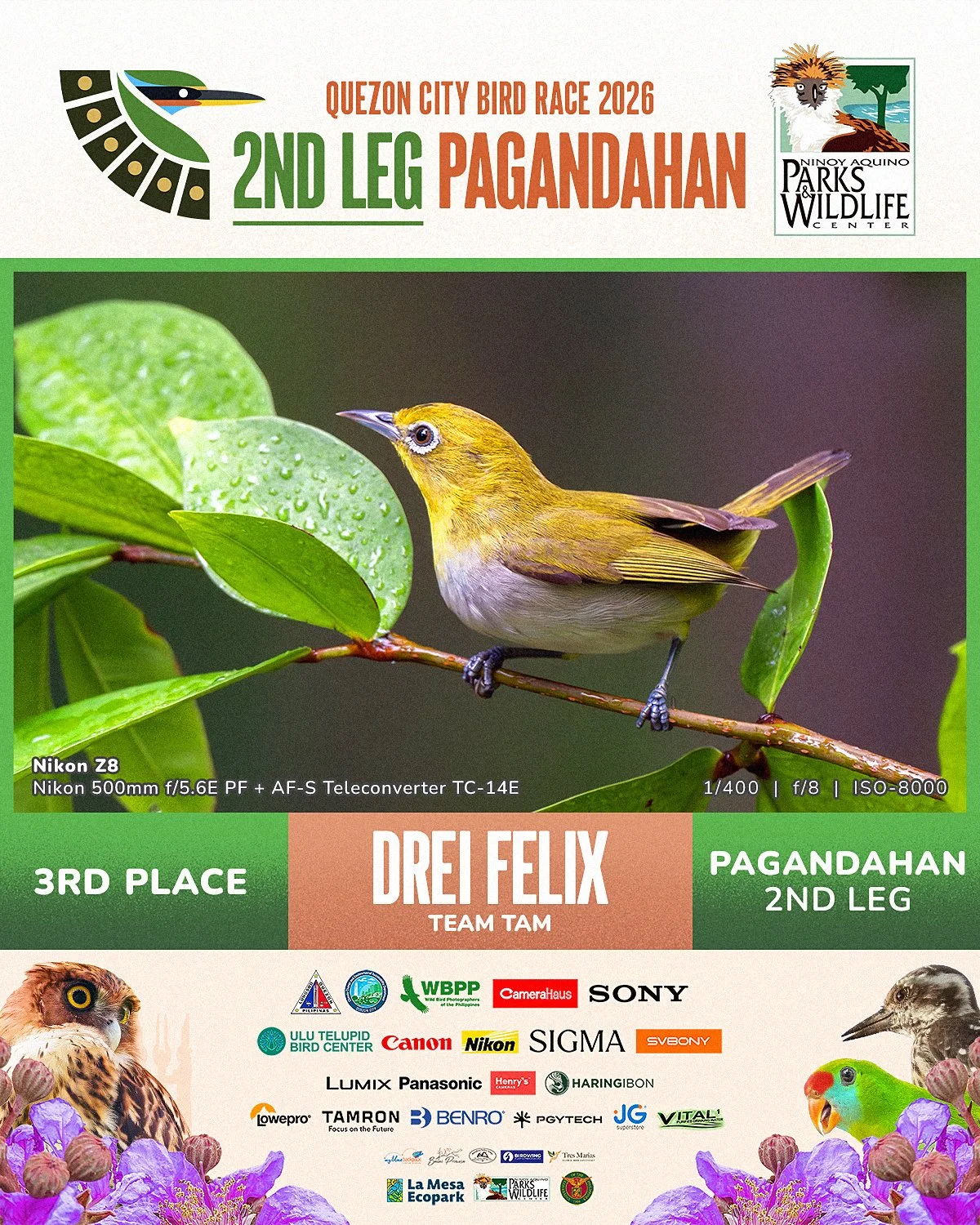
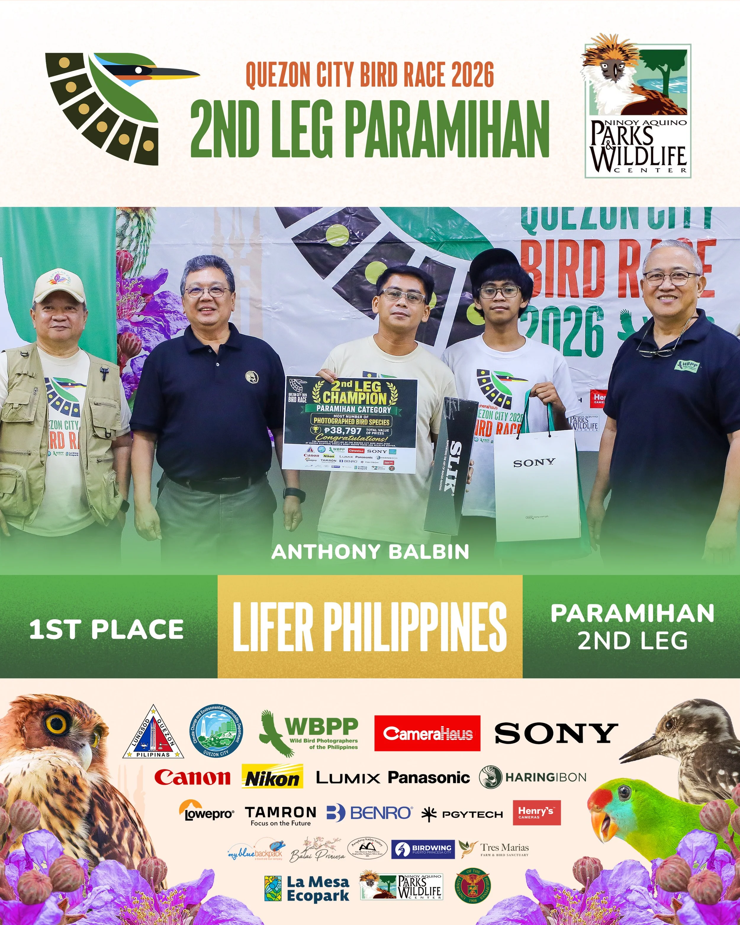
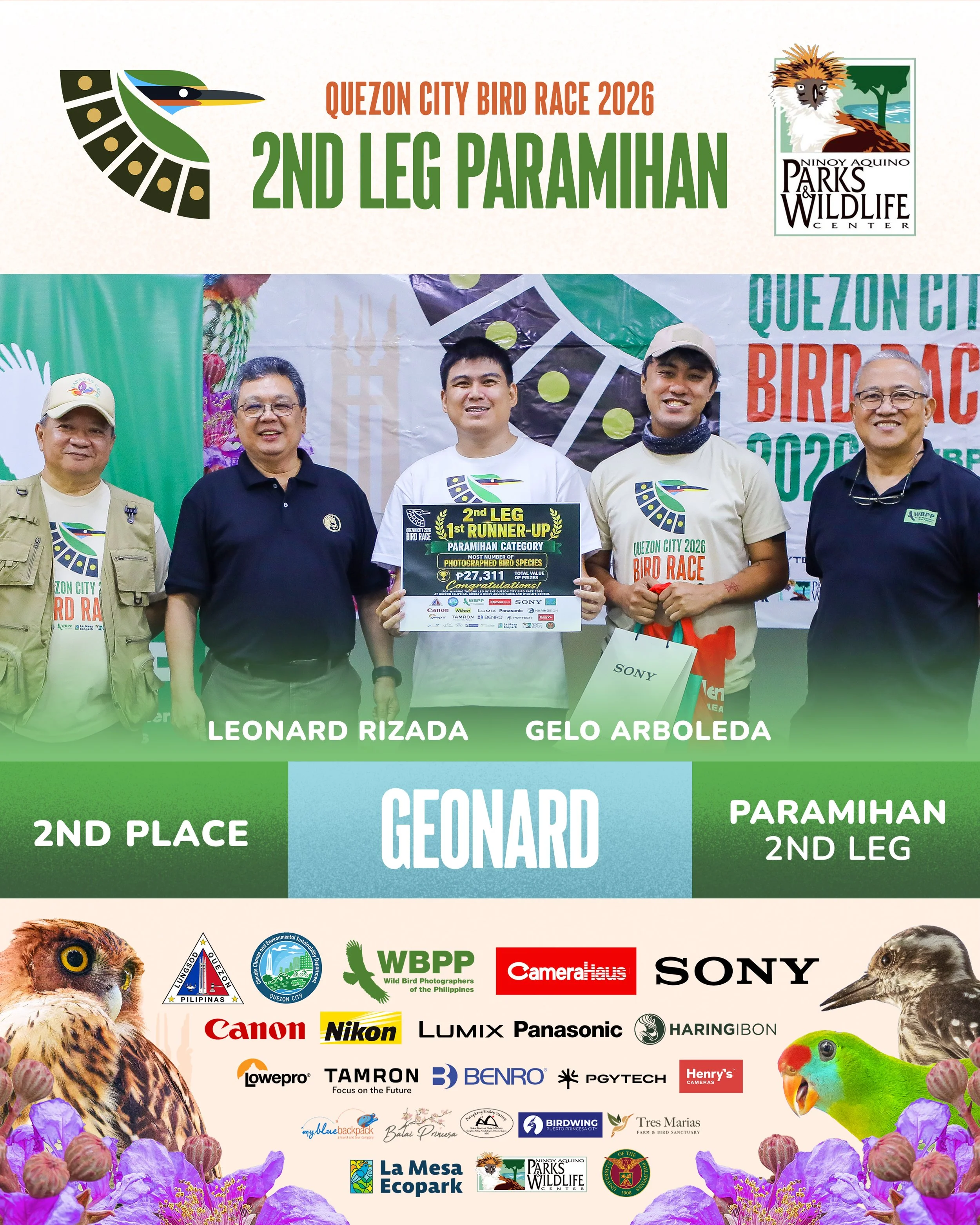
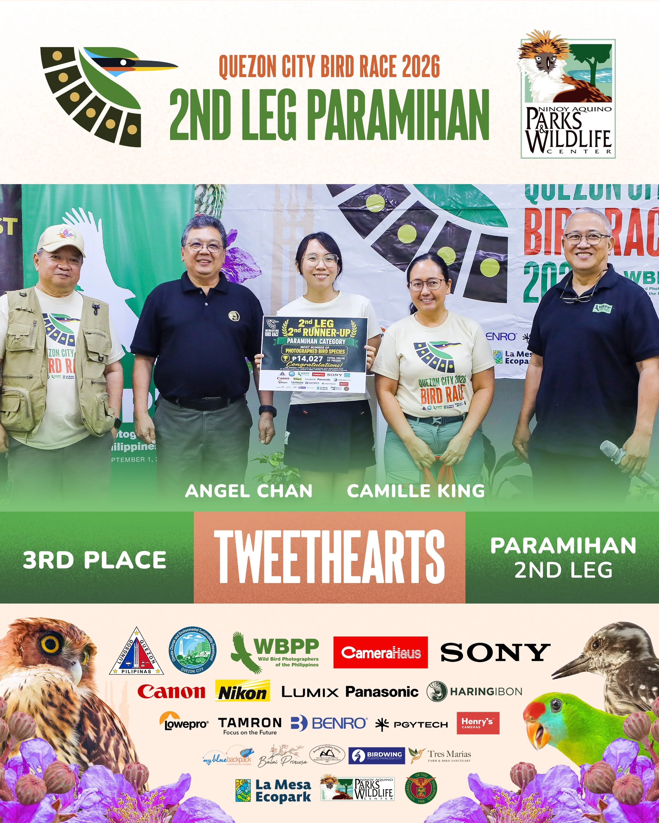
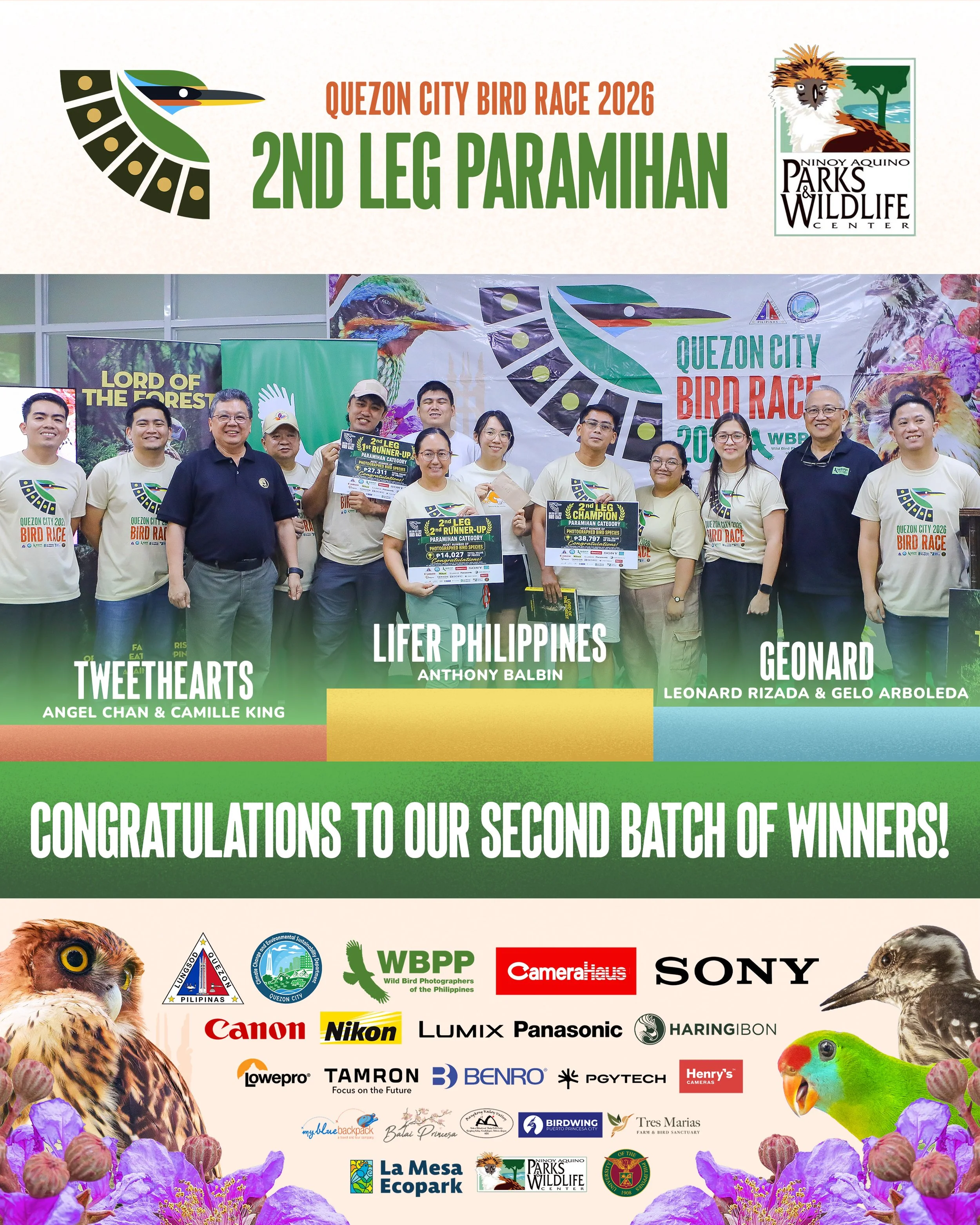
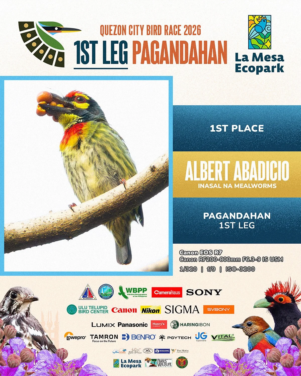
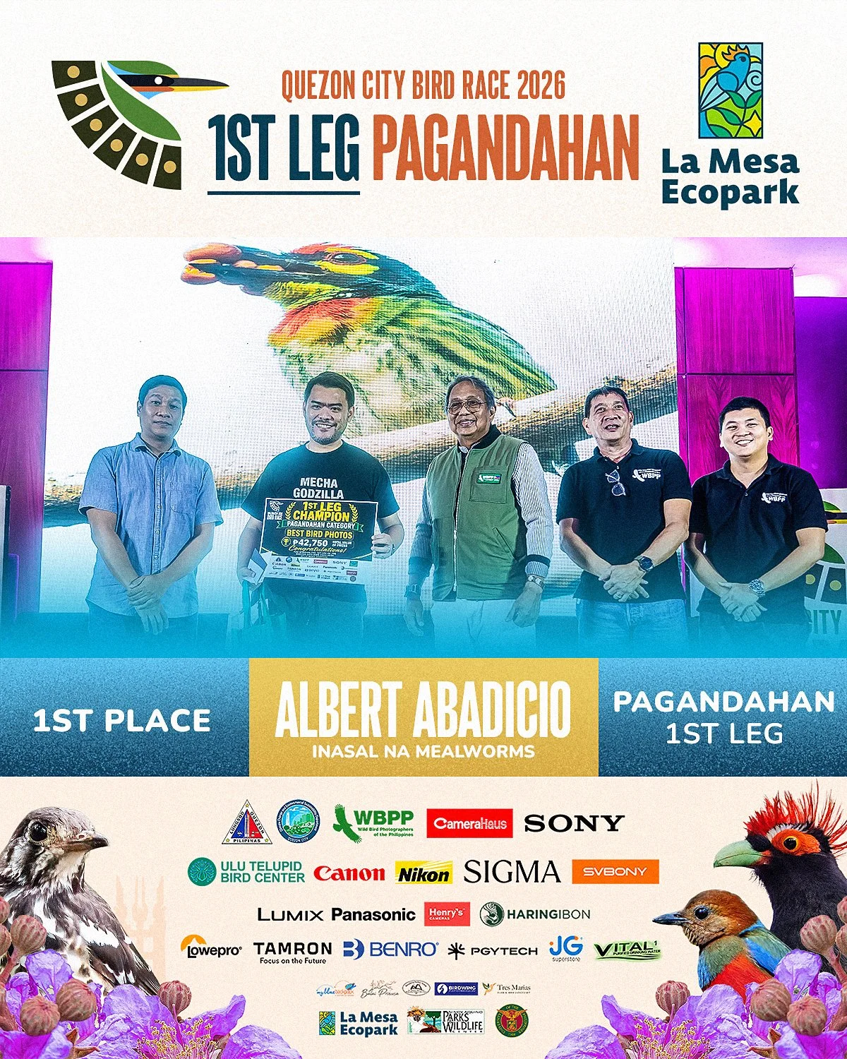
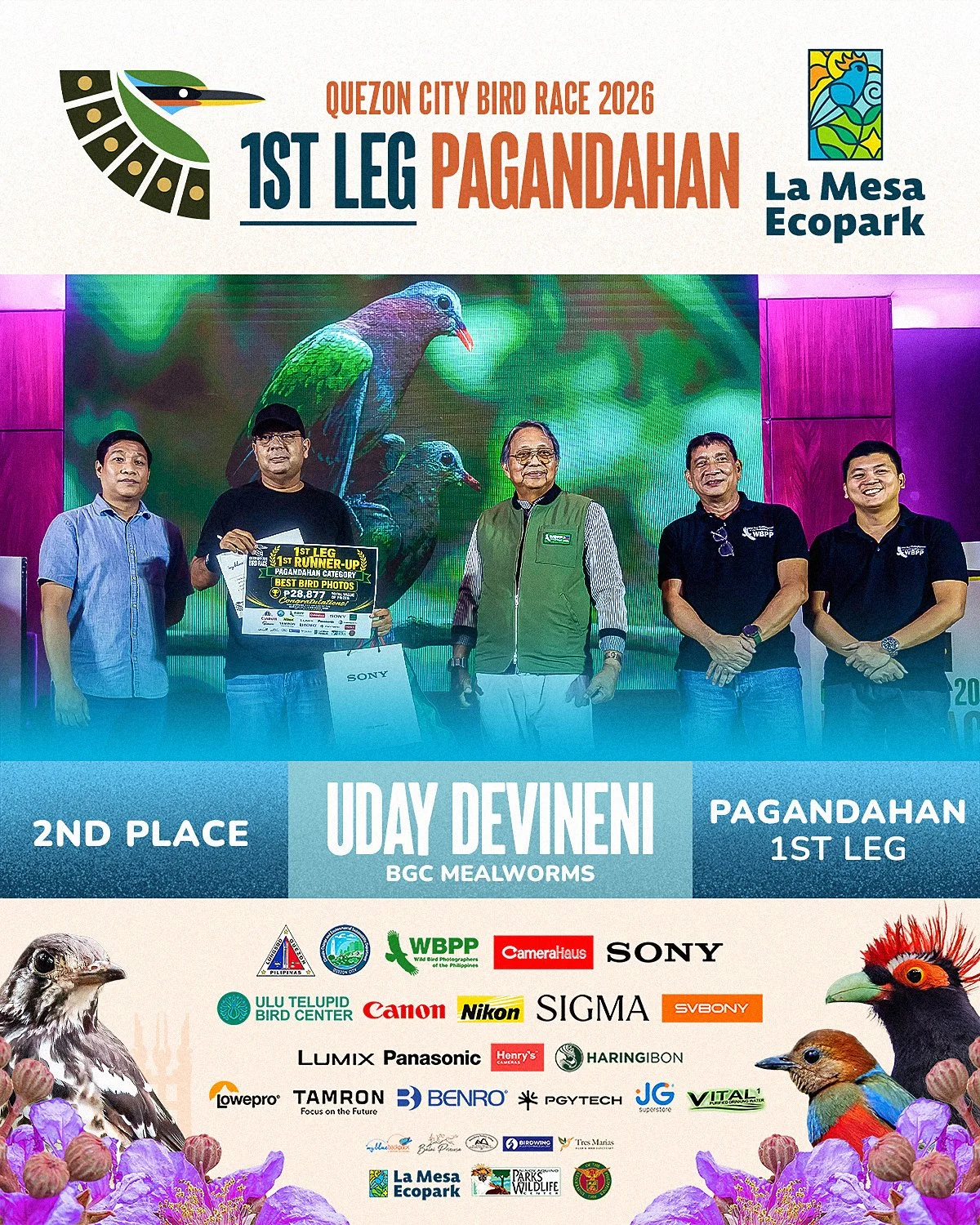
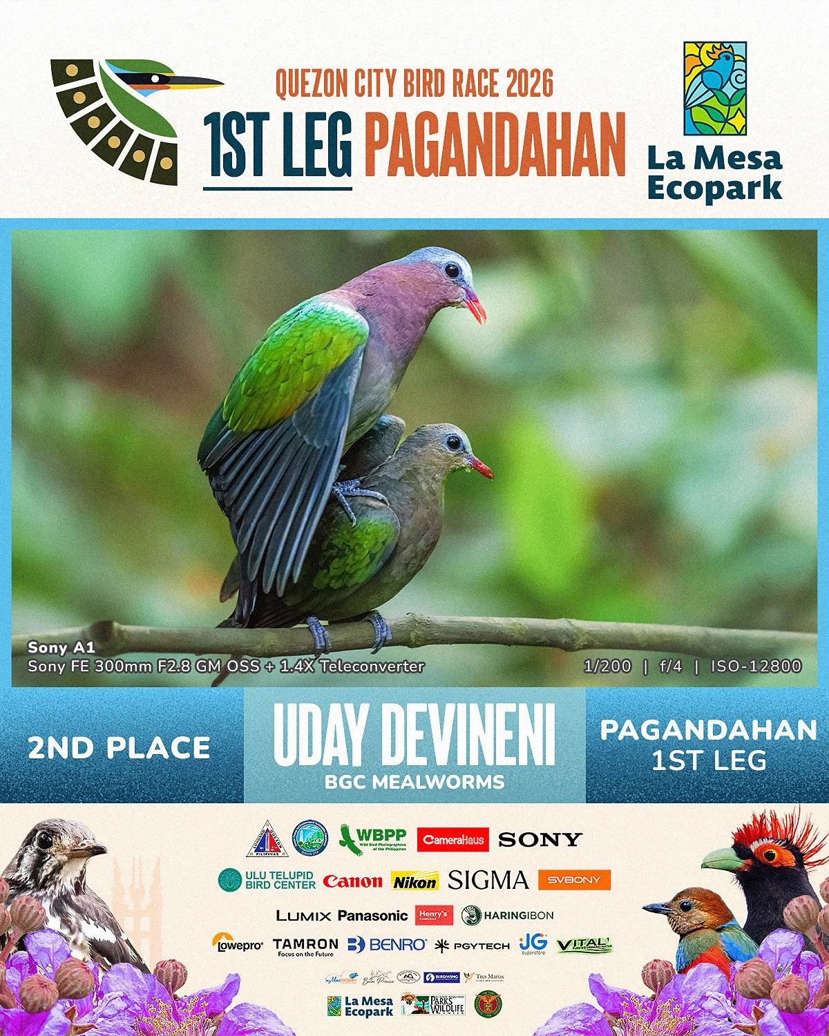
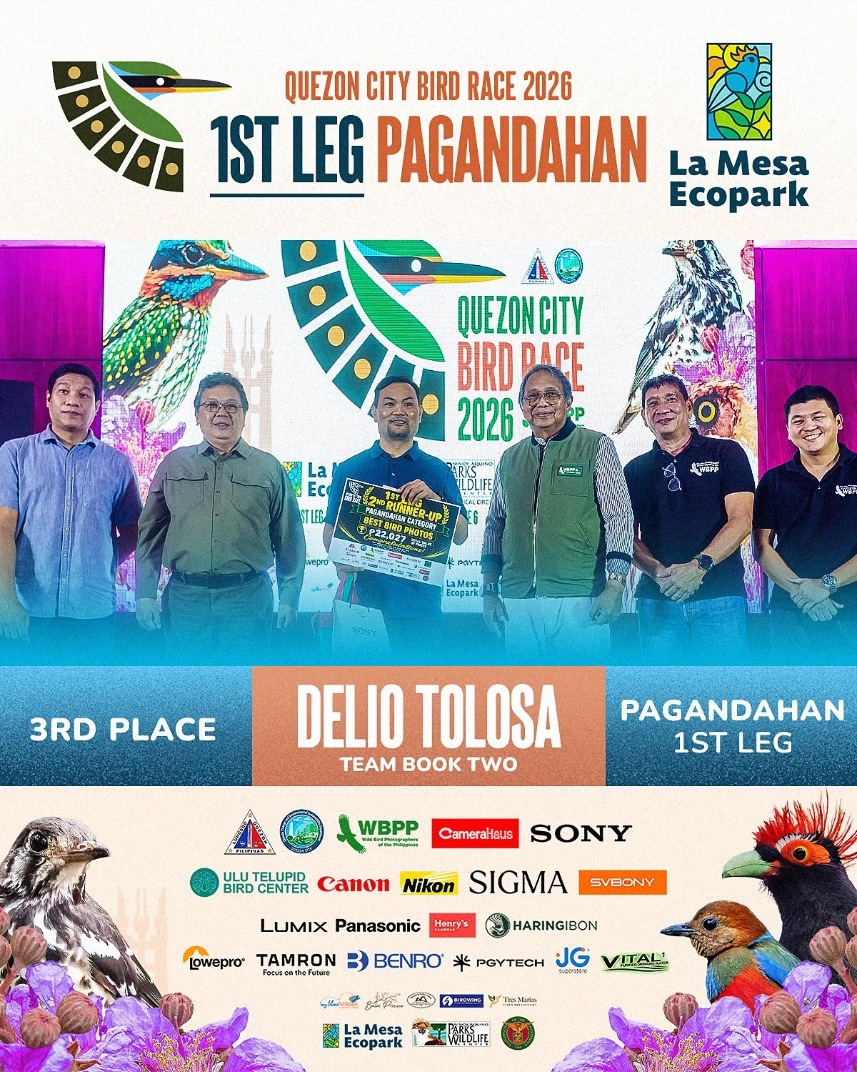
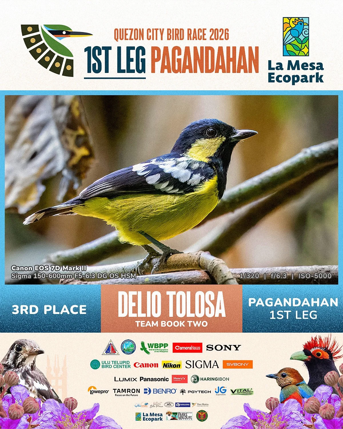
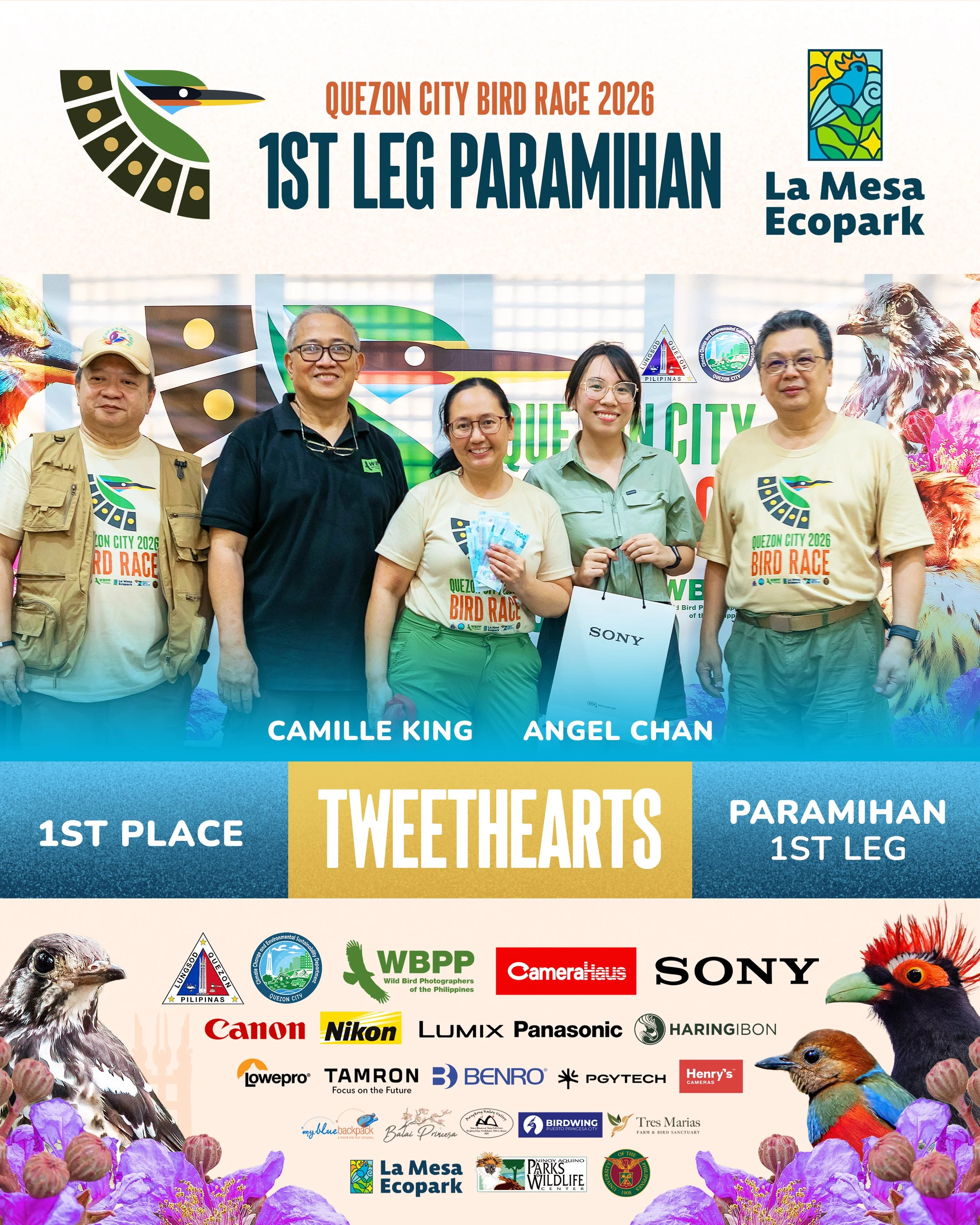
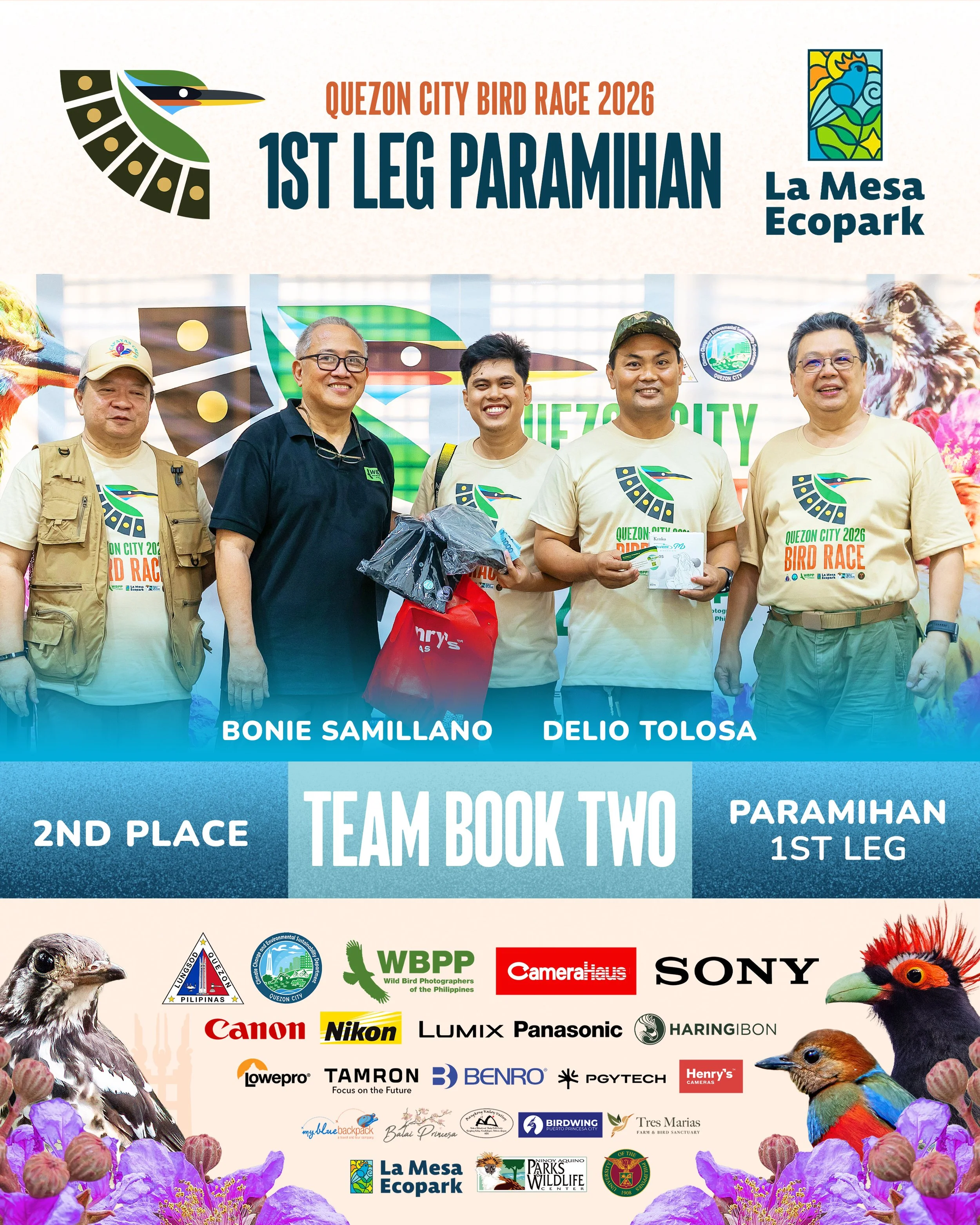
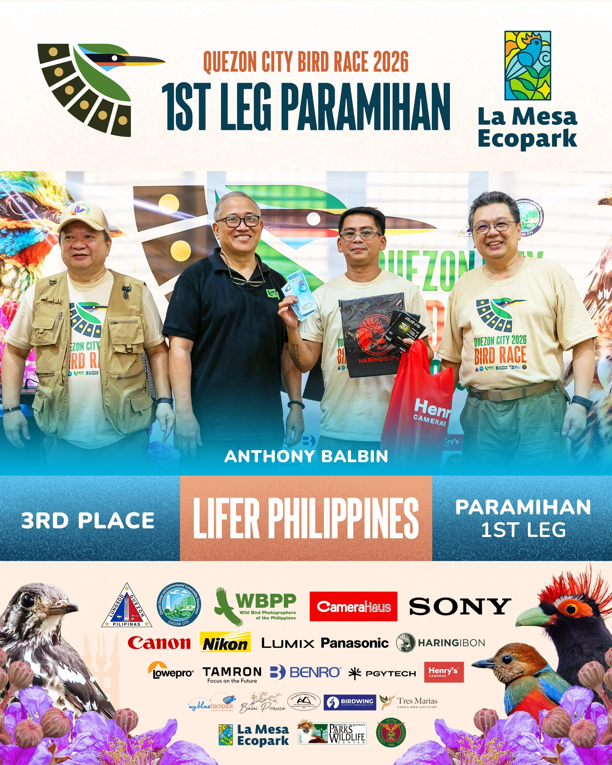
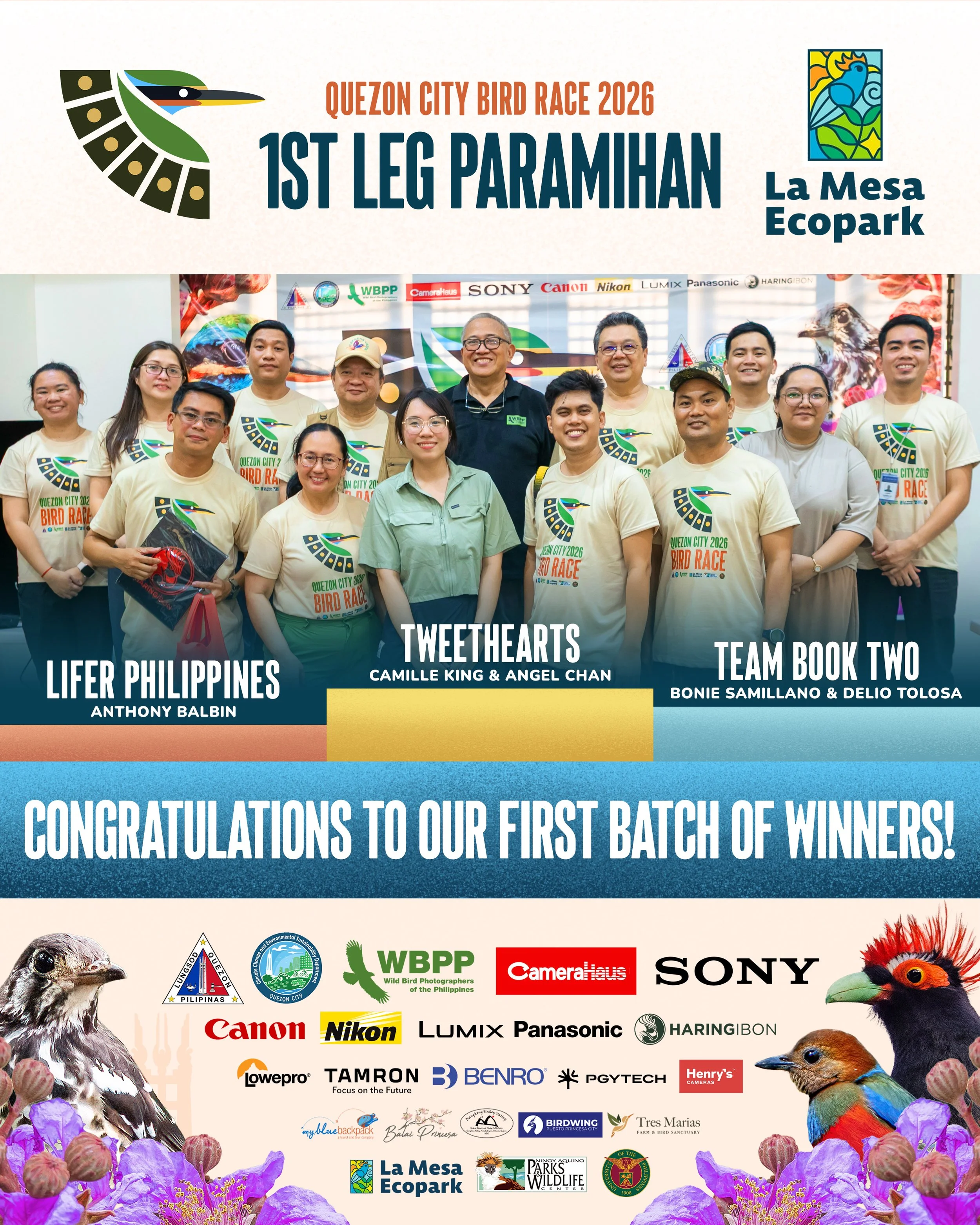
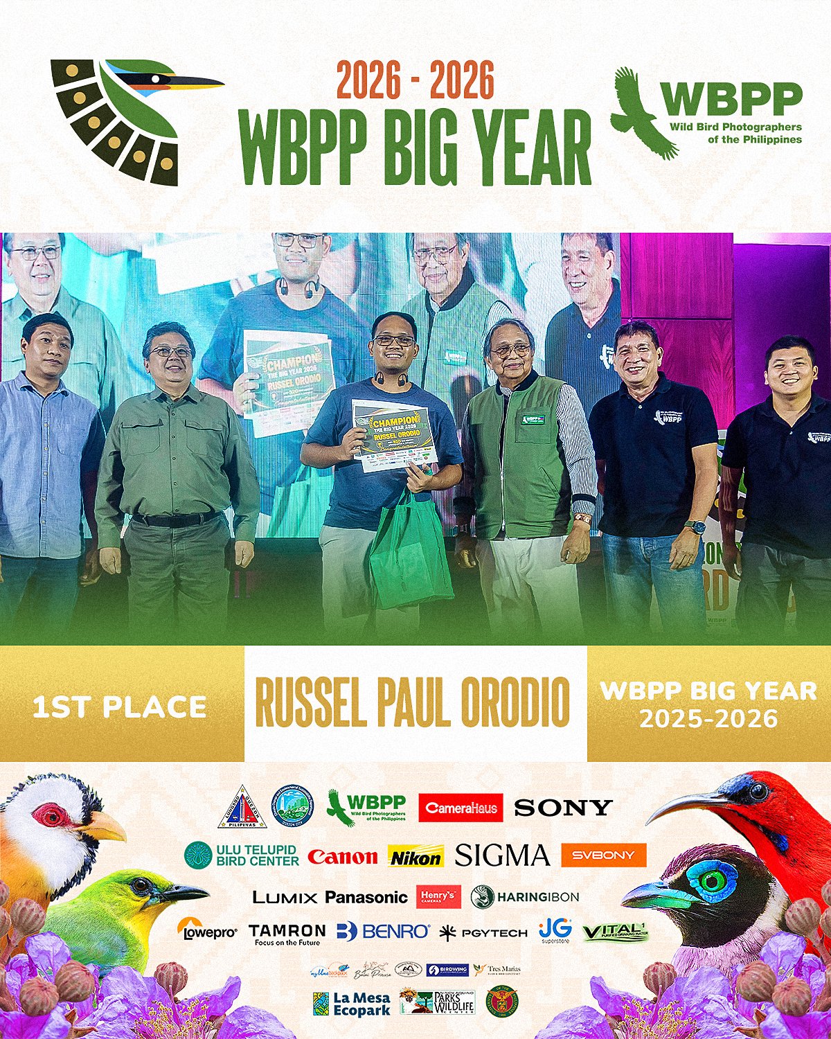
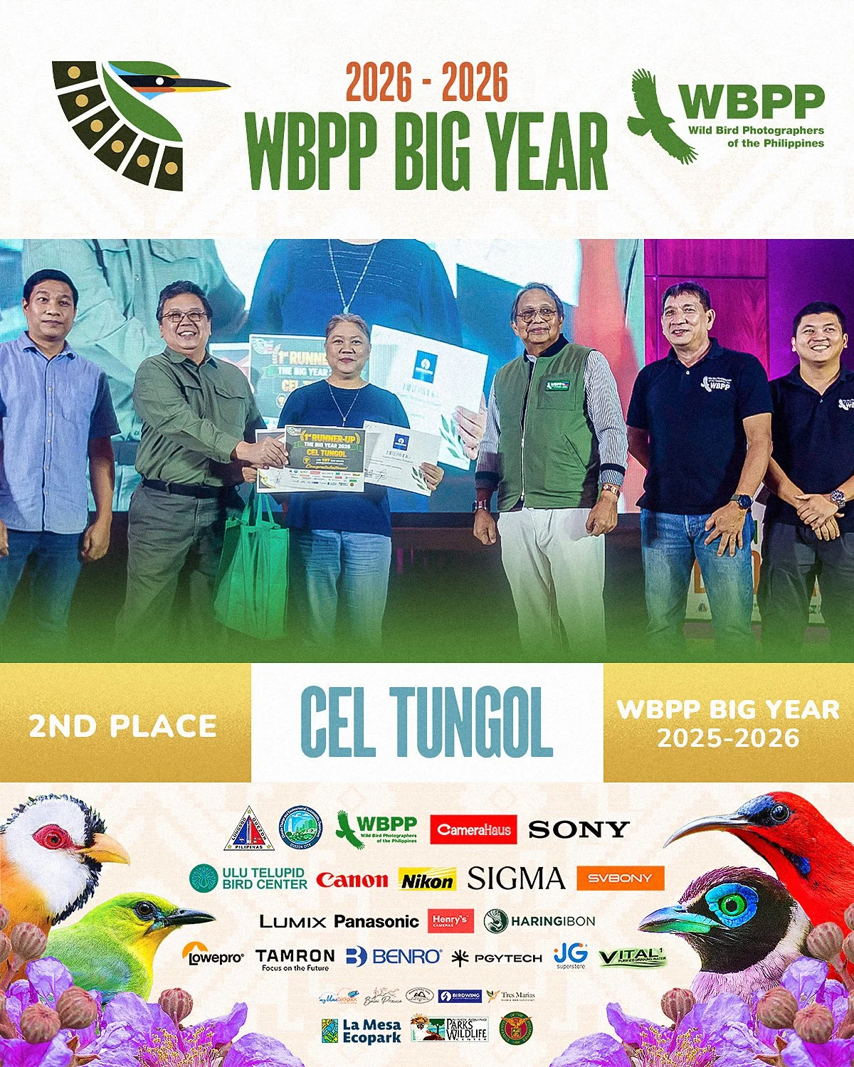
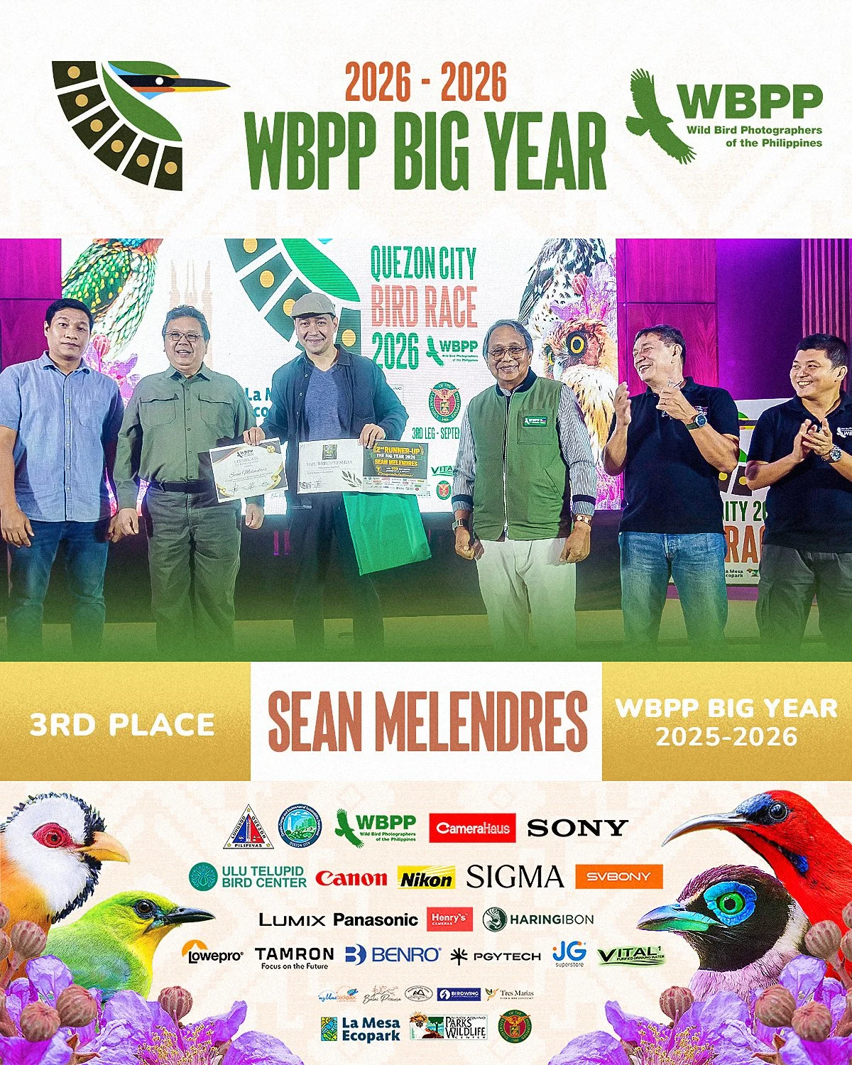
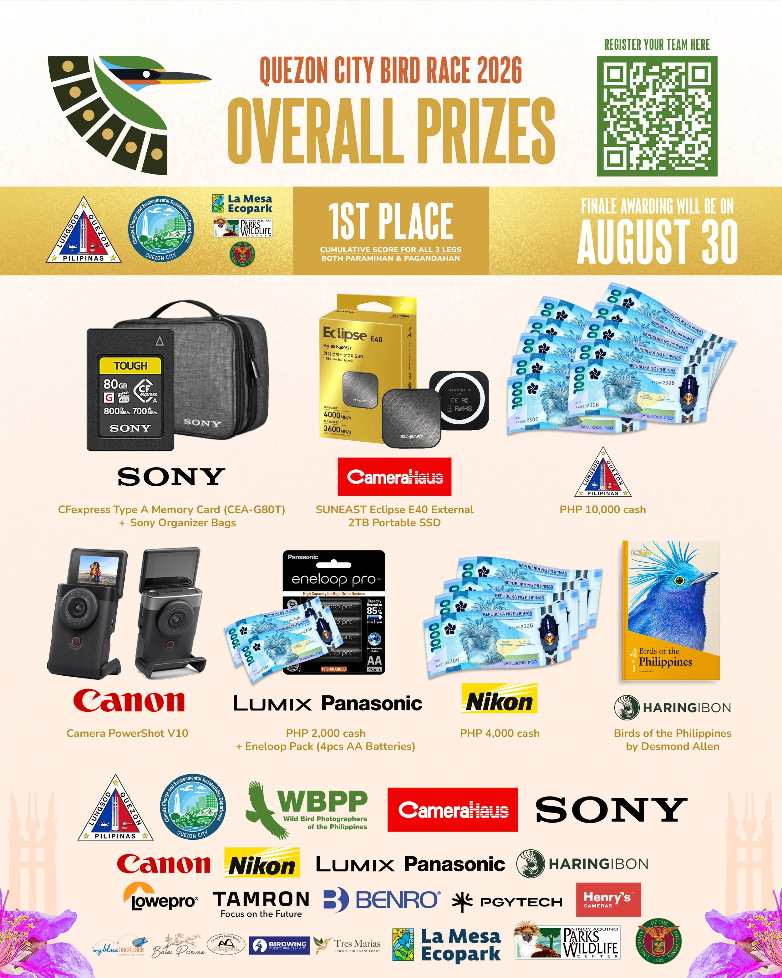
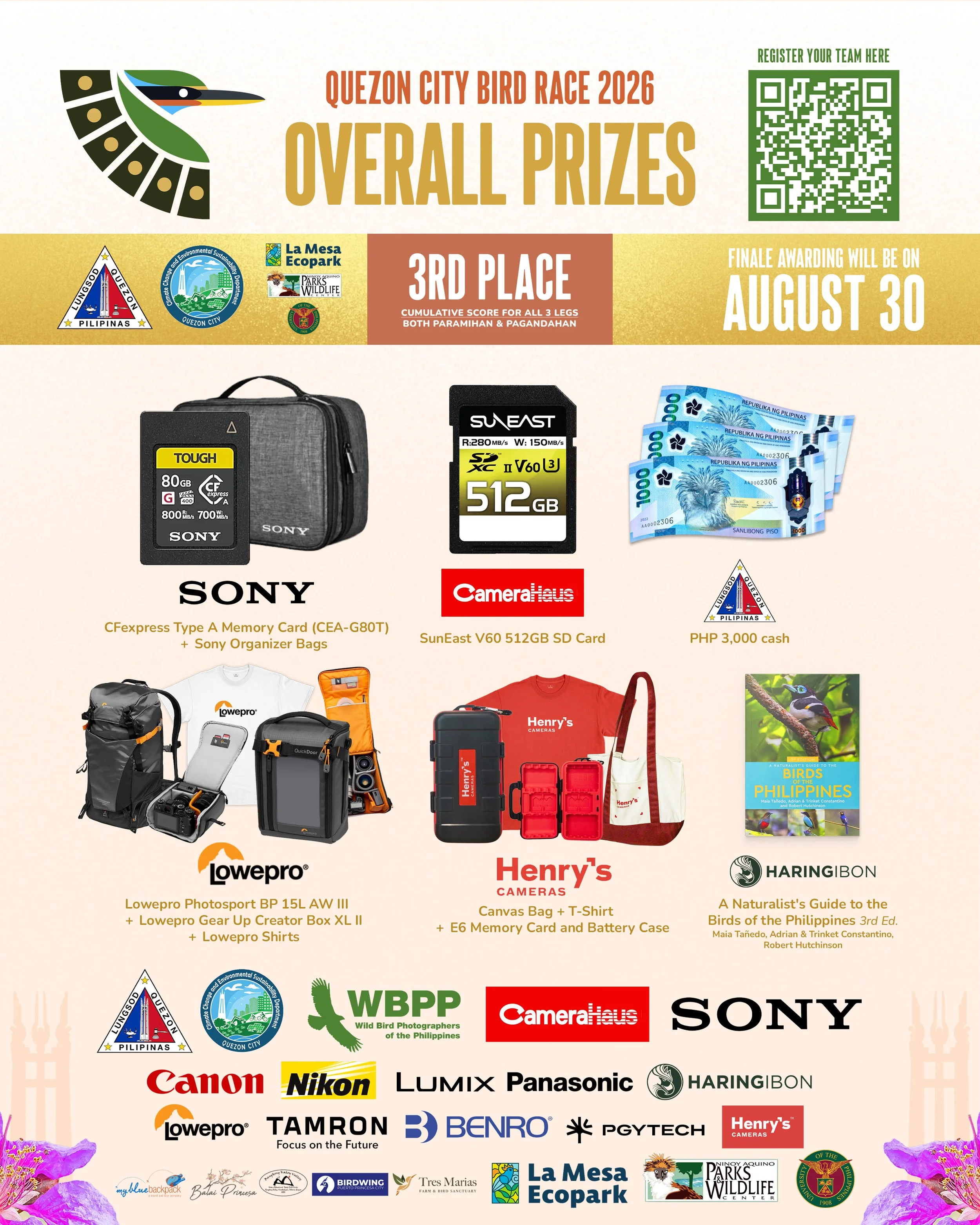
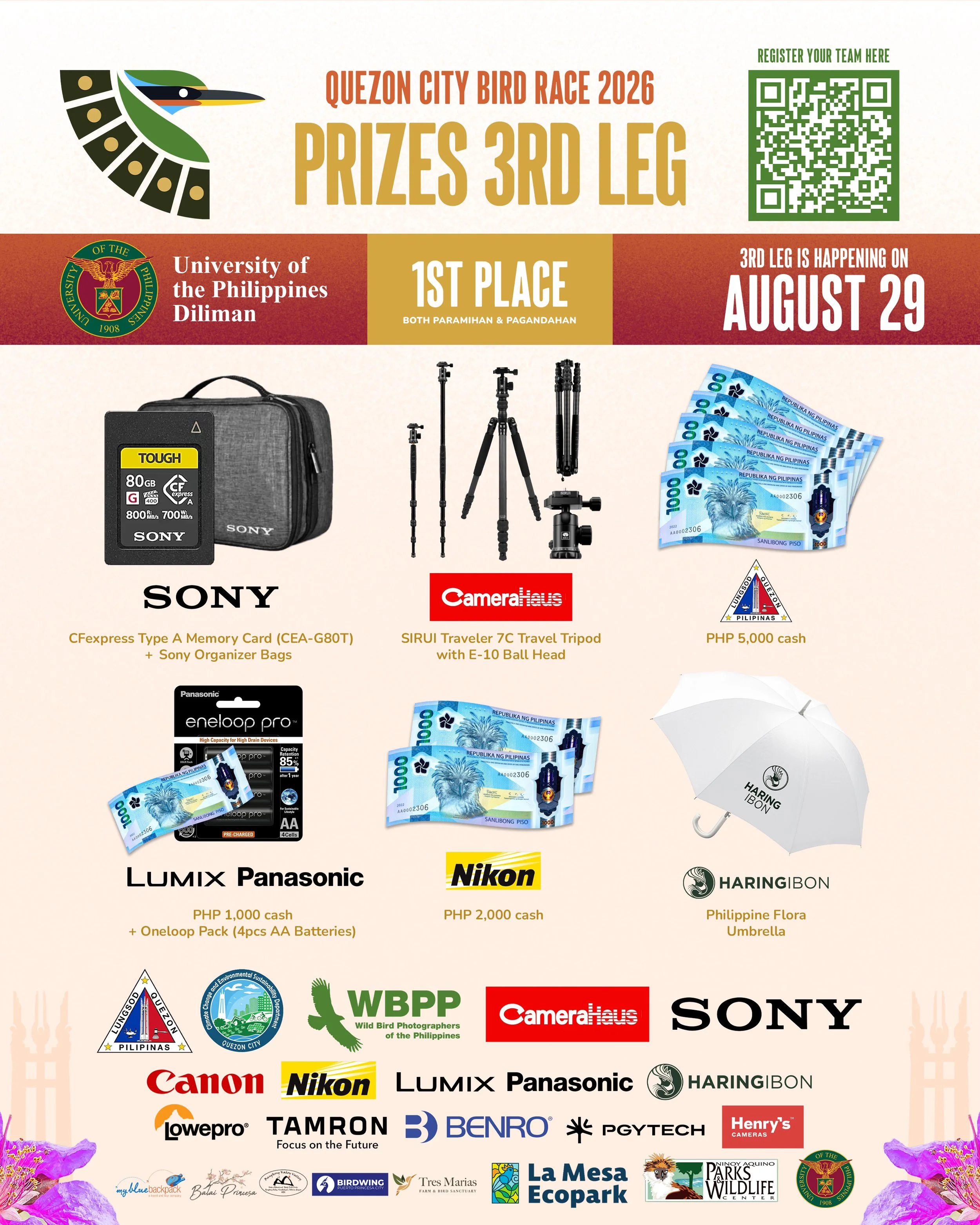
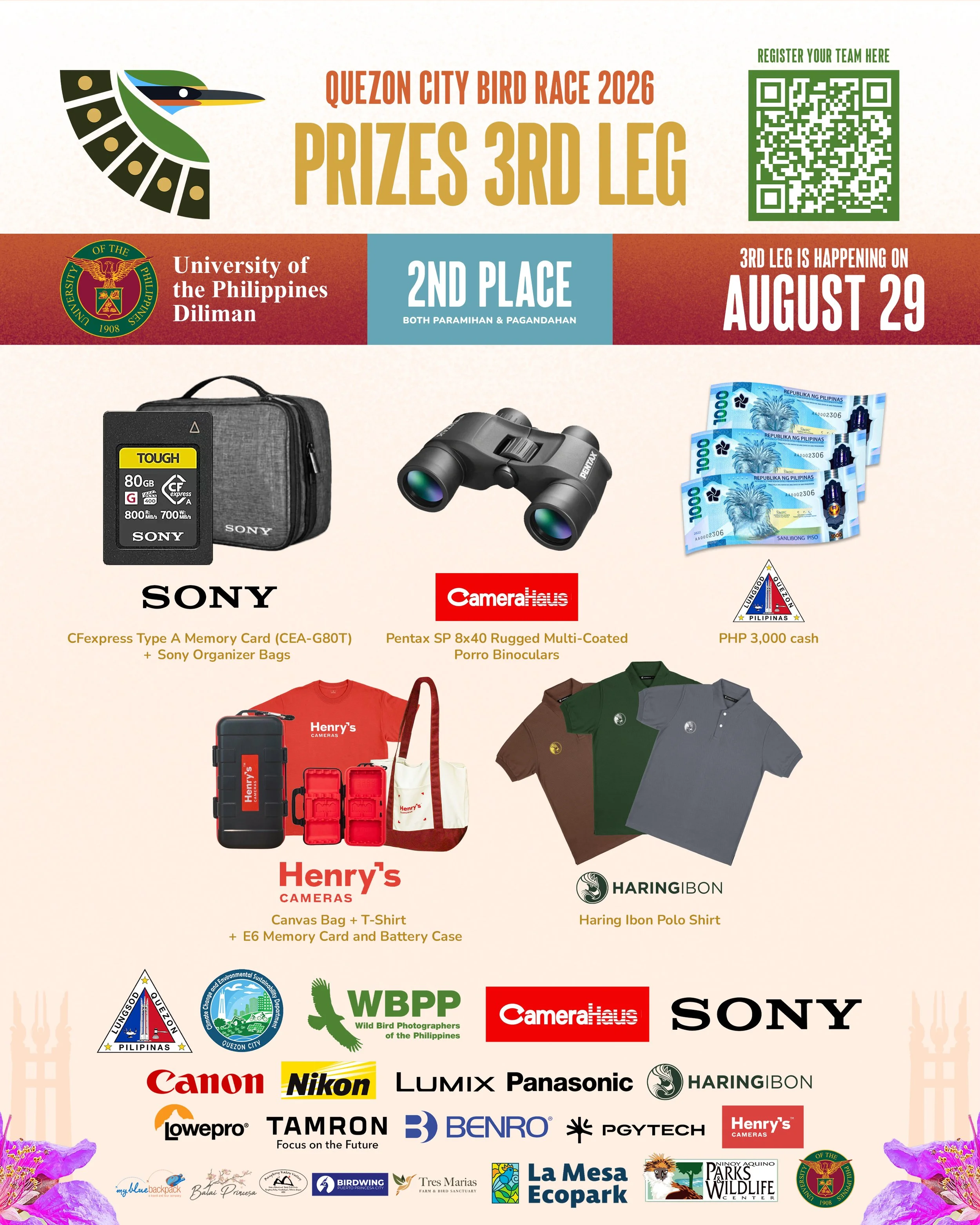
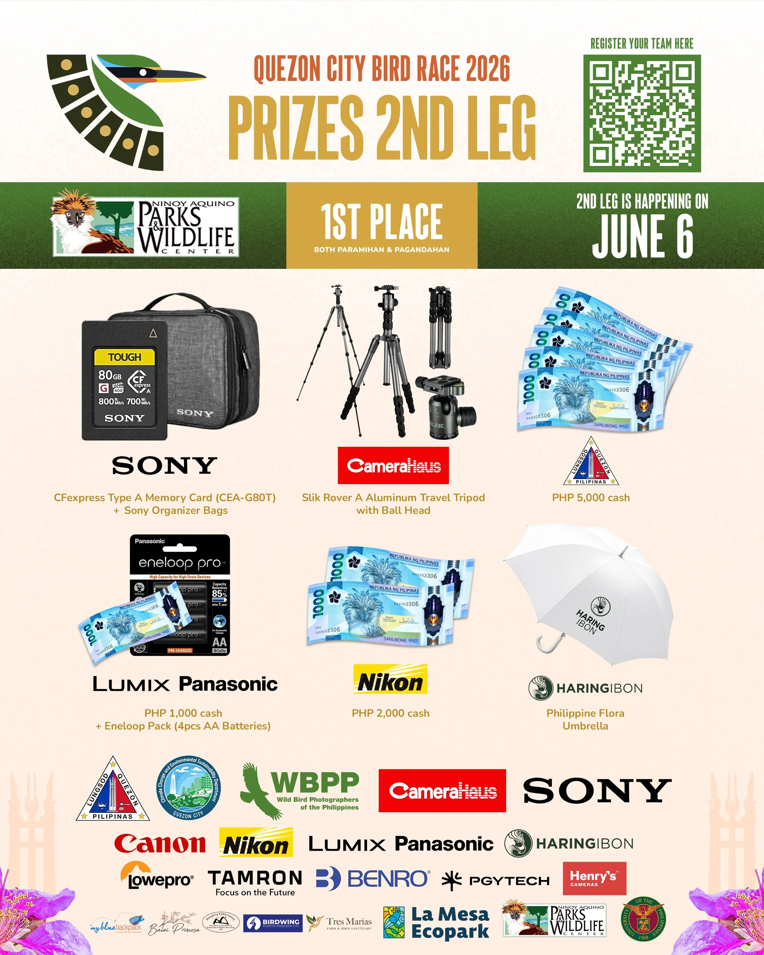
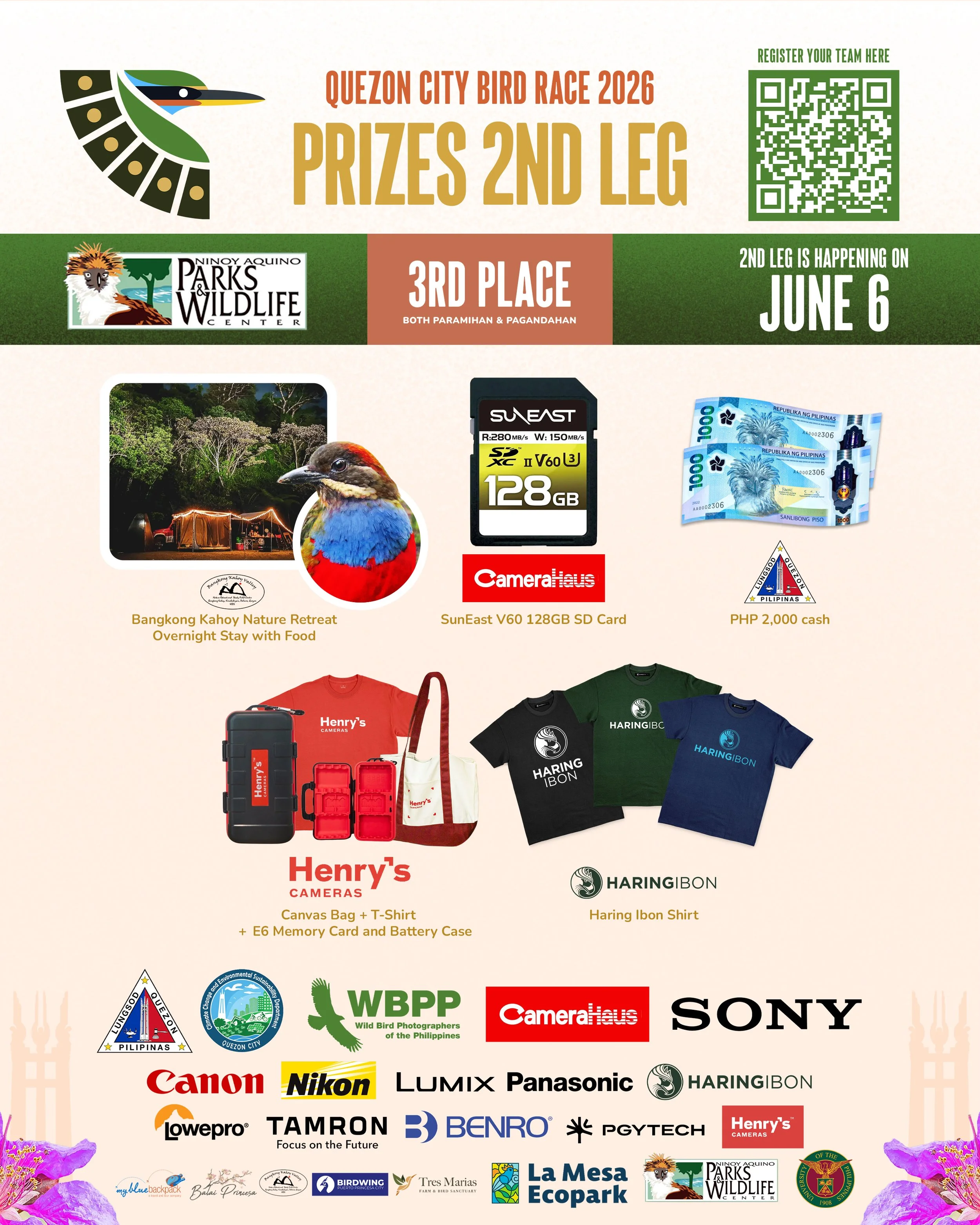
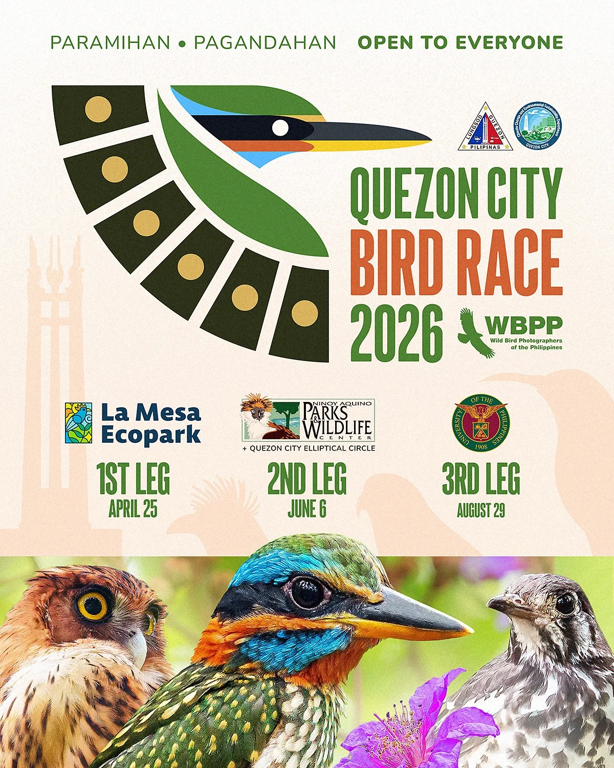
In addition to the logo, I also created the announcement post for the Quezon City Bird Race, as well as the Awarding posts, which I posted the same day as the Awarding event for each leg.